VISUAL IDENTITY
Trailer Bridge
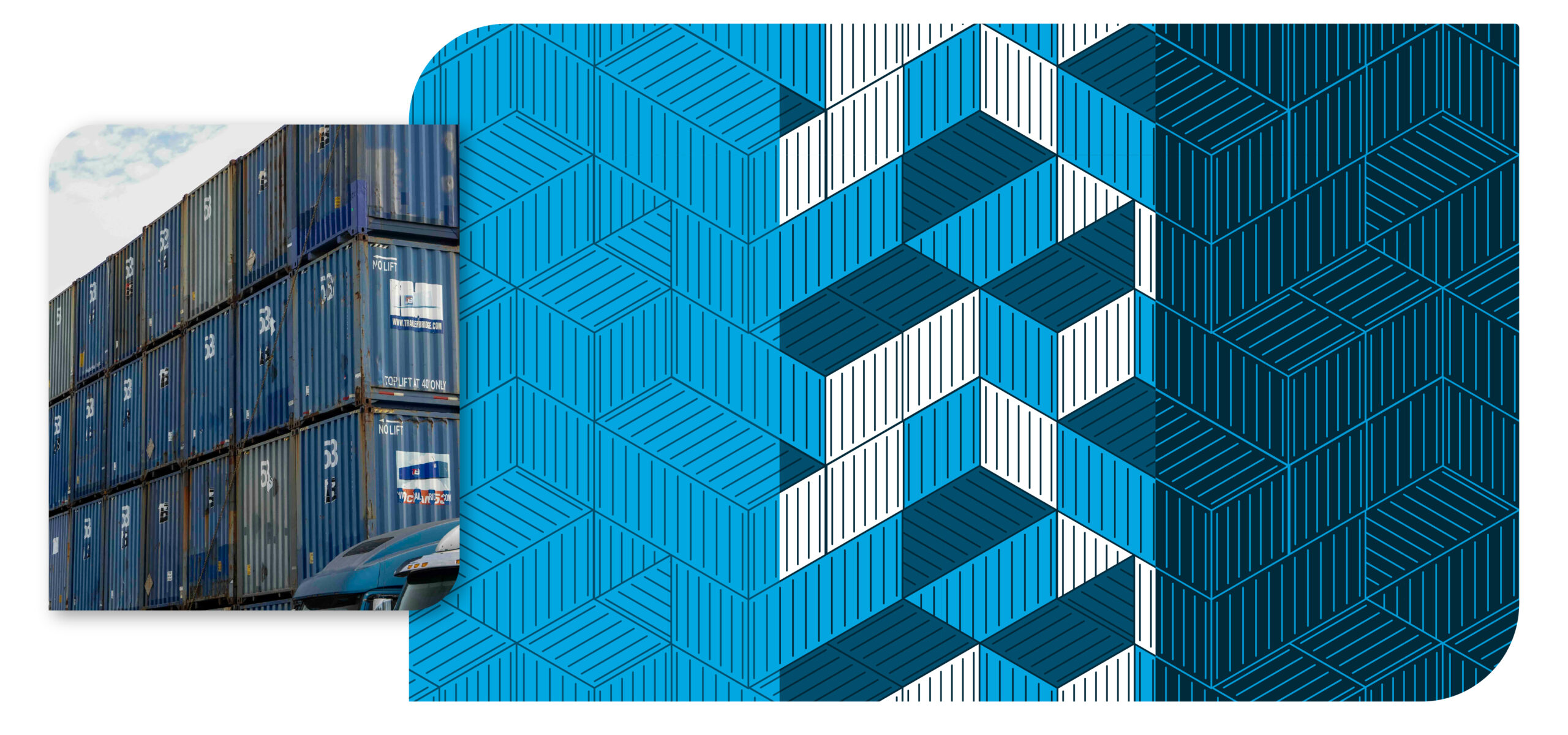
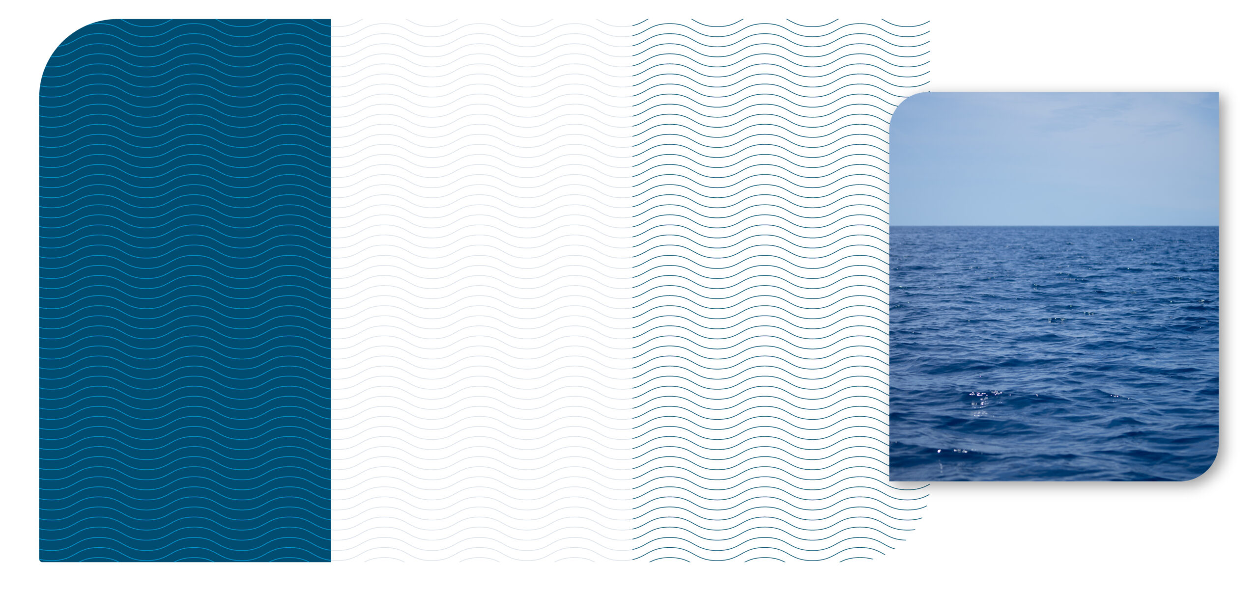
BRANDING
Visual Identity
Trailer Bridge is a logistics company based in Jacksonville, FL. As part of the marketing team’s strategy to enhance brand awareness and recognition, I was tasked with reviewing the existing visual identity, identifying areas for improvement, and expanding the brand’s visual system. I developed a comprehensive icon library, custom shapes and patterns, as well as templates for social graphics and digital banners, among other design assets. These efforts strengthened brand recognition and helped the company stand out from larger competitors.
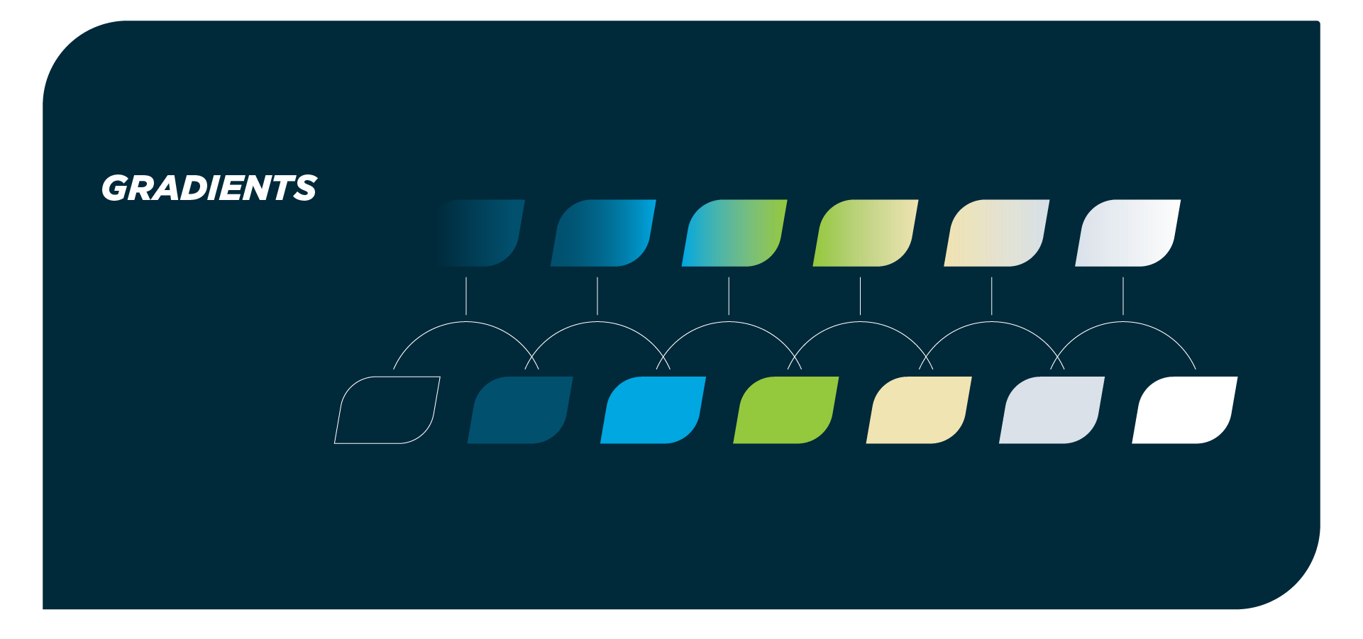
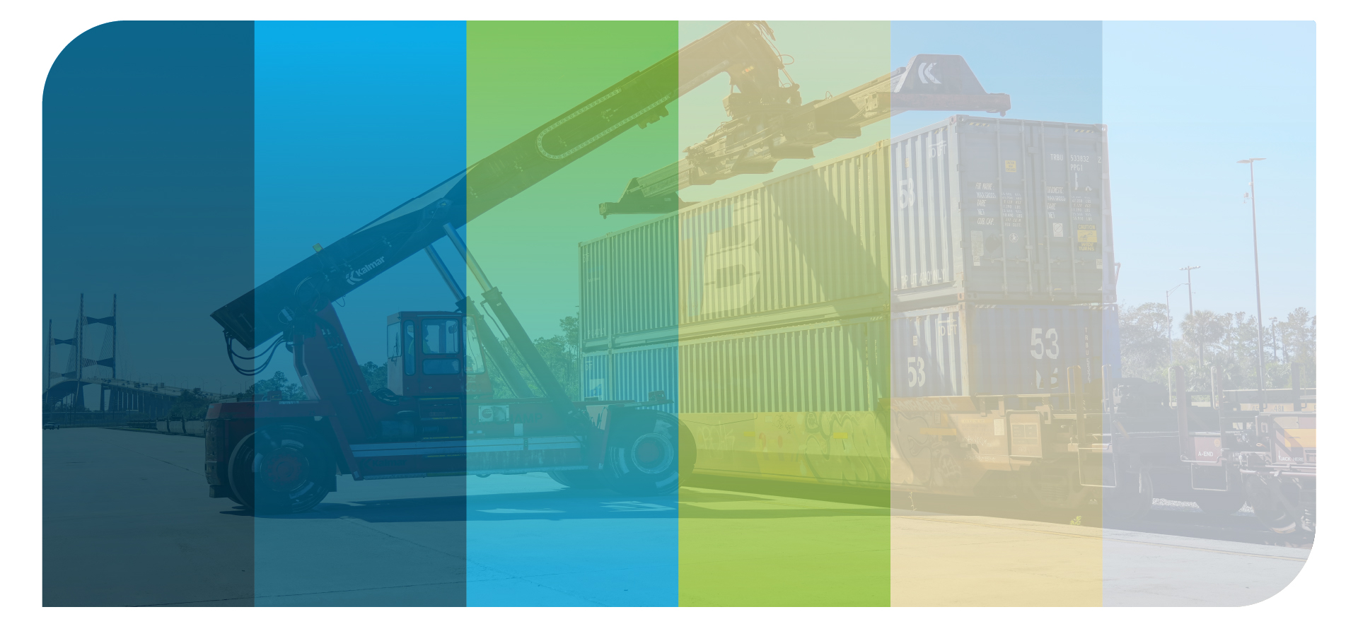
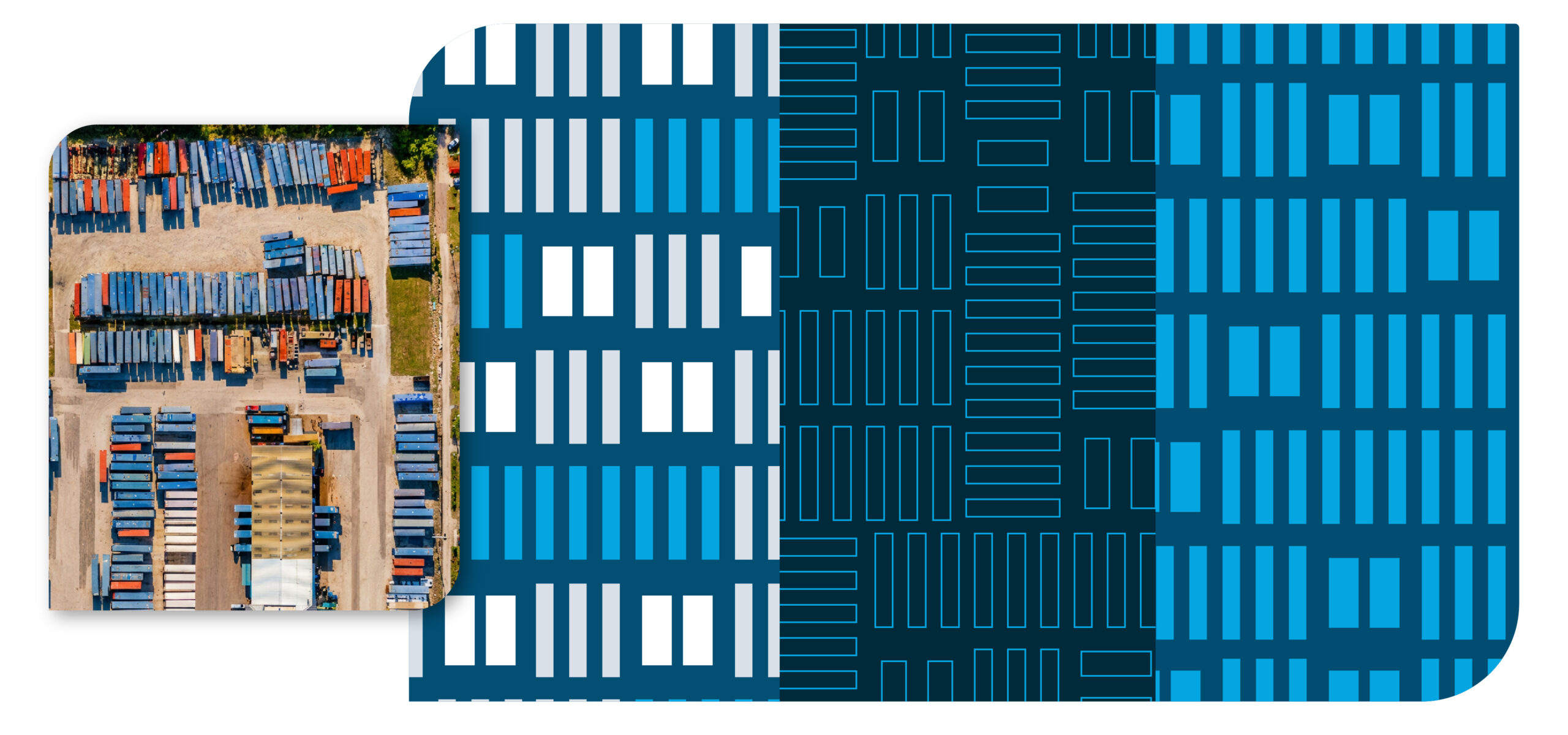
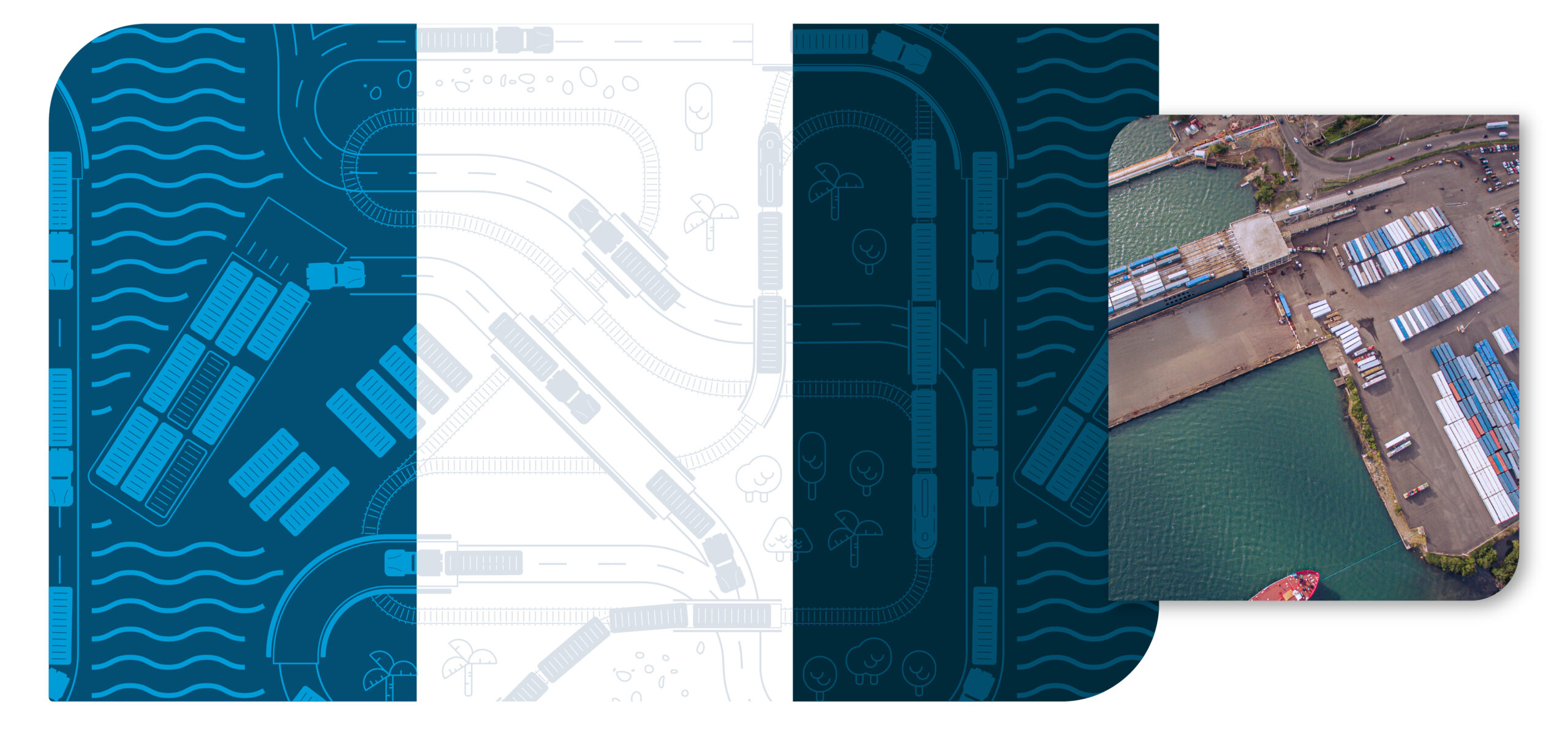
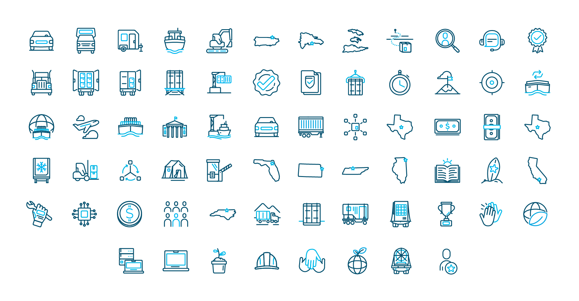
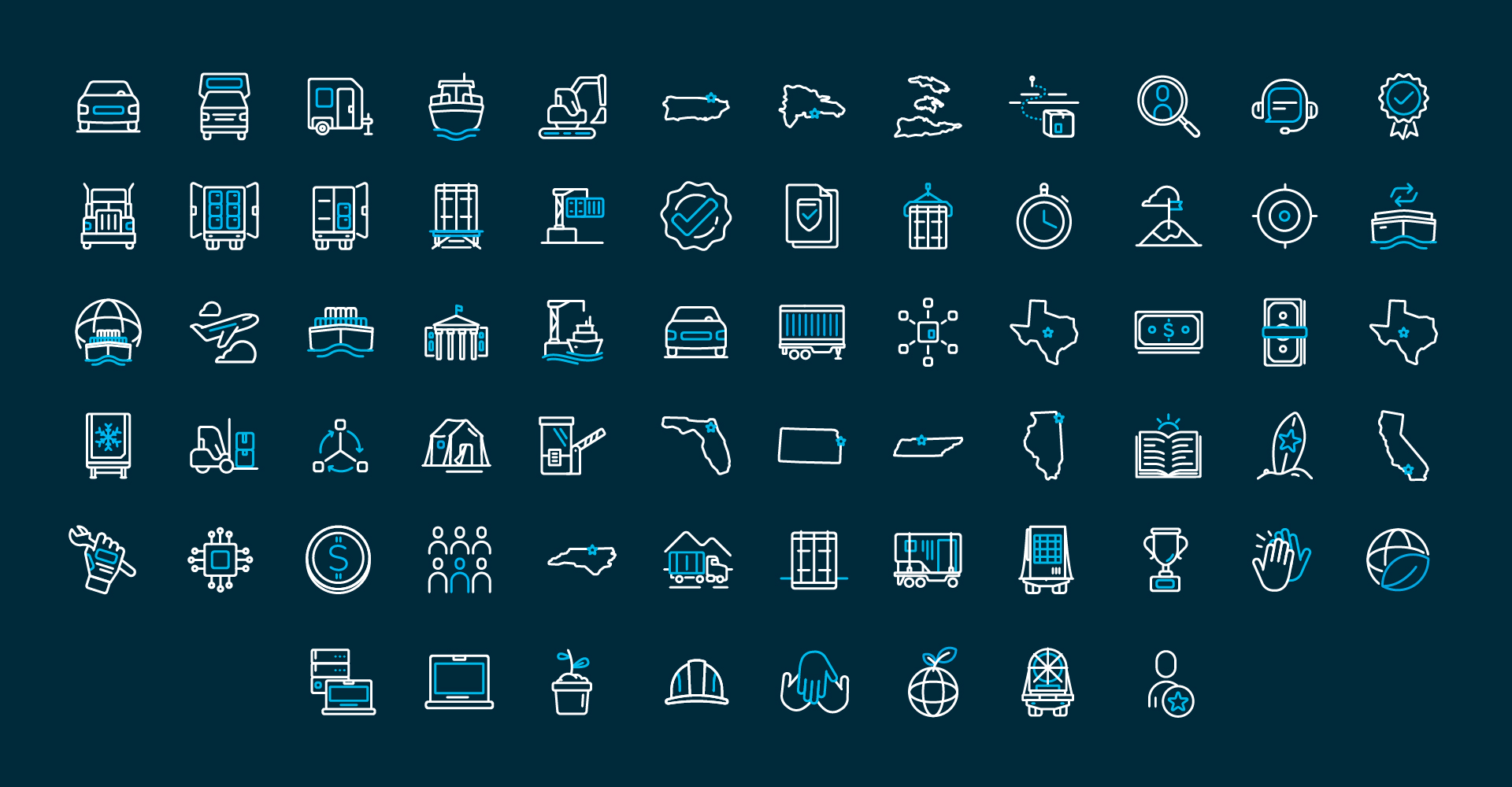
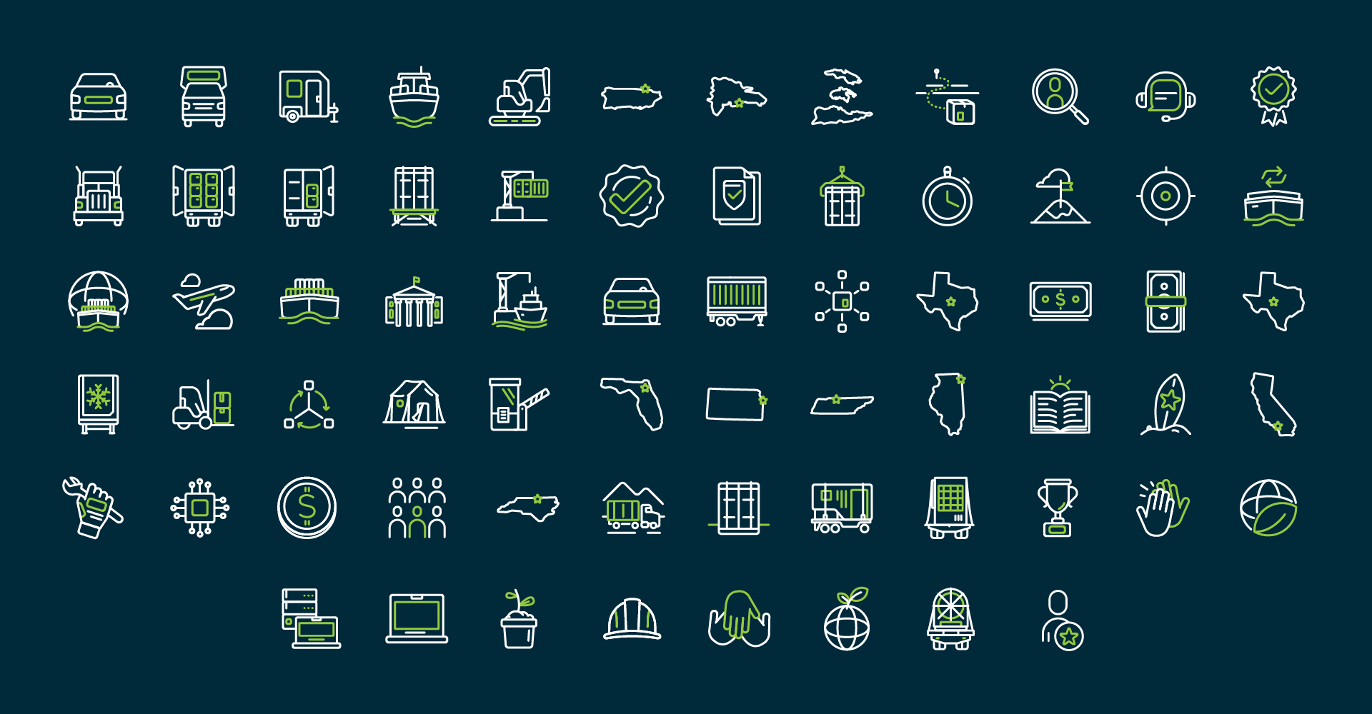
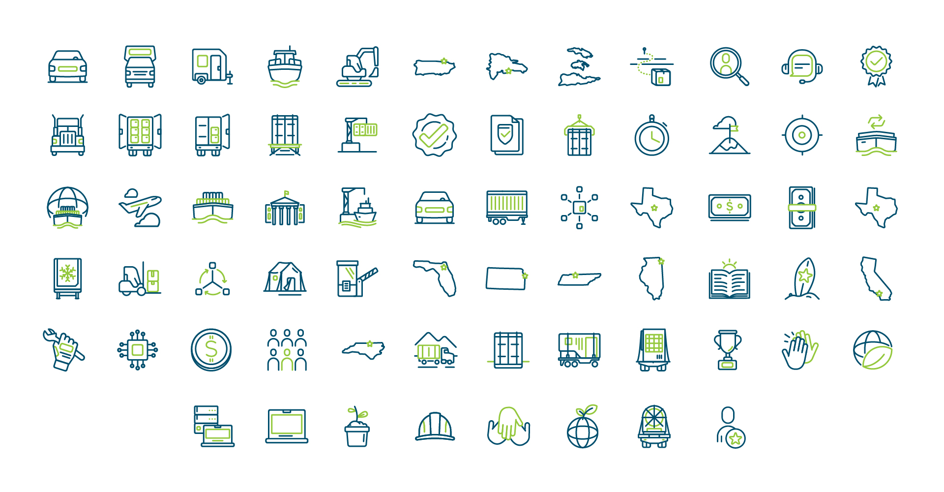
BRANDING
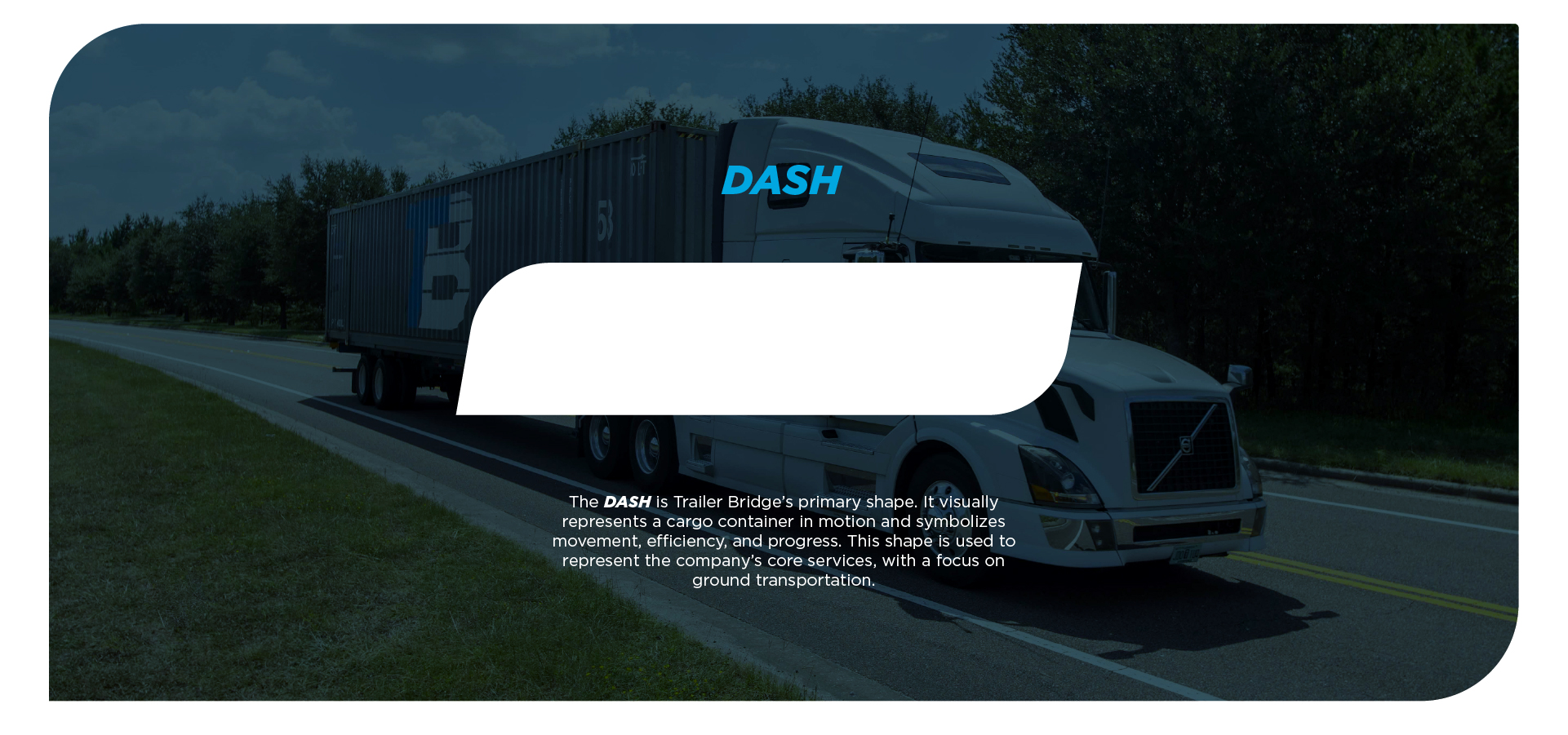
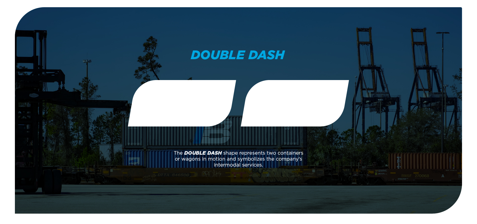
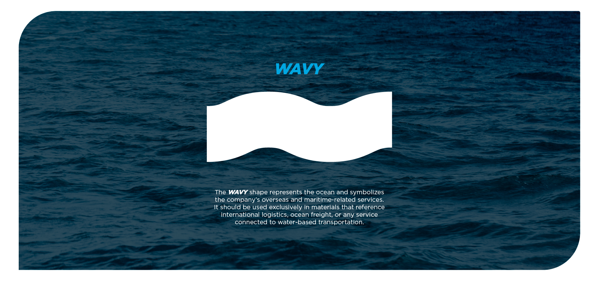
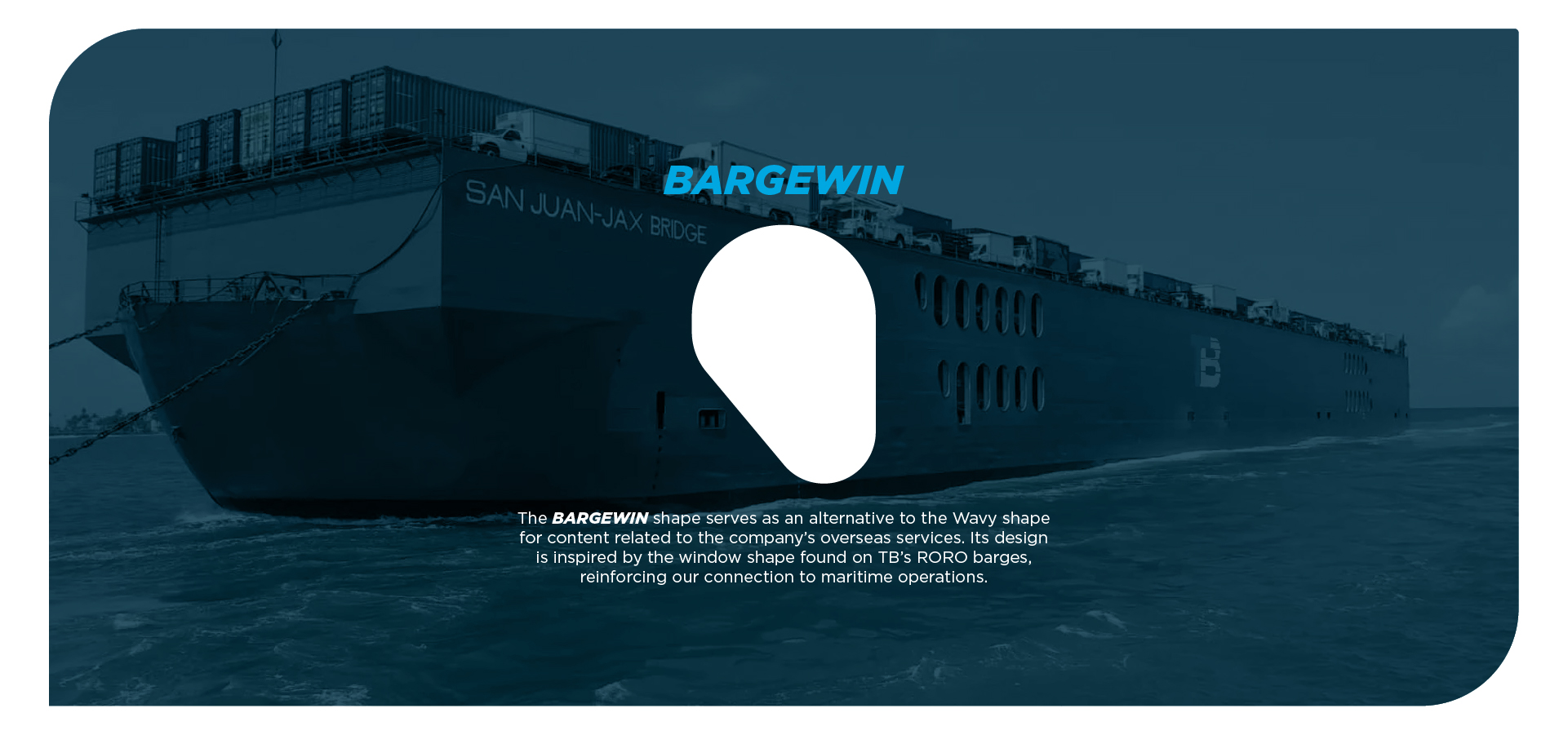
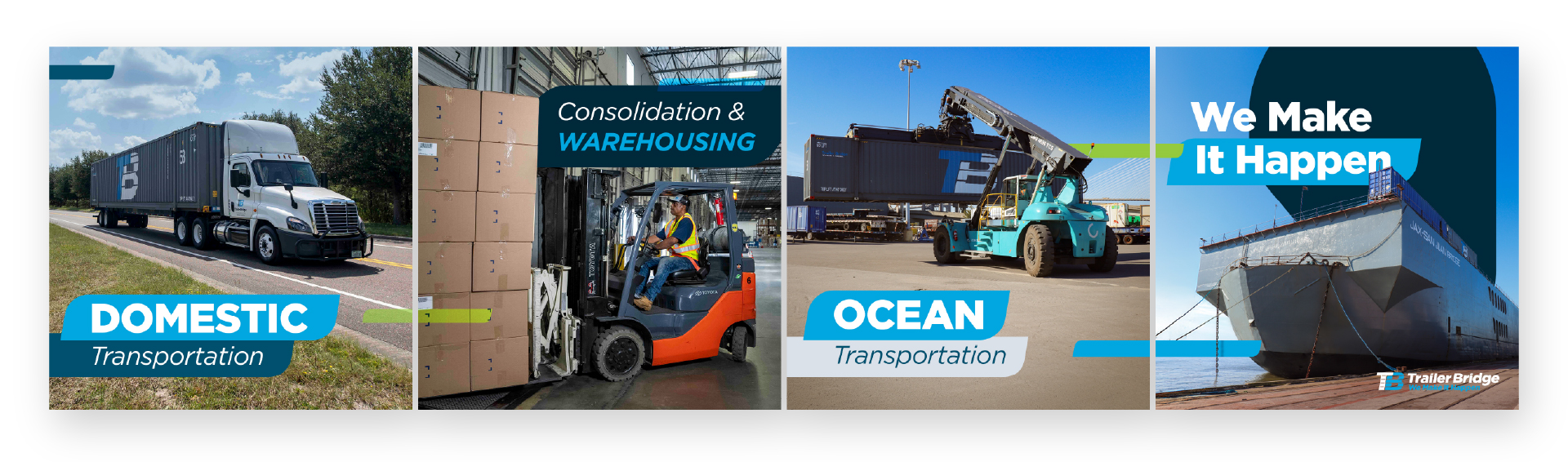
Icons
One of the brand’s visual challenges was the limited availability of industry-specific iconography, which required sourcing icons from multiple platforms and resulted in a fragmented and inconsistent visual language. These icons were used not only across digital platforms, such as our website, but also in printed materials including banners and traffic signage displayed at the port. I conducted a comprehensive audit of all existing icons and collaborated with the team to define the most accurate and strategic representations of our services, products, and operational activities. Following thorough research, I developed a custom icon library that addresses the company’s visual needs, distinguishes our brand from competitors, and establishes a cohesive and unified visual system.
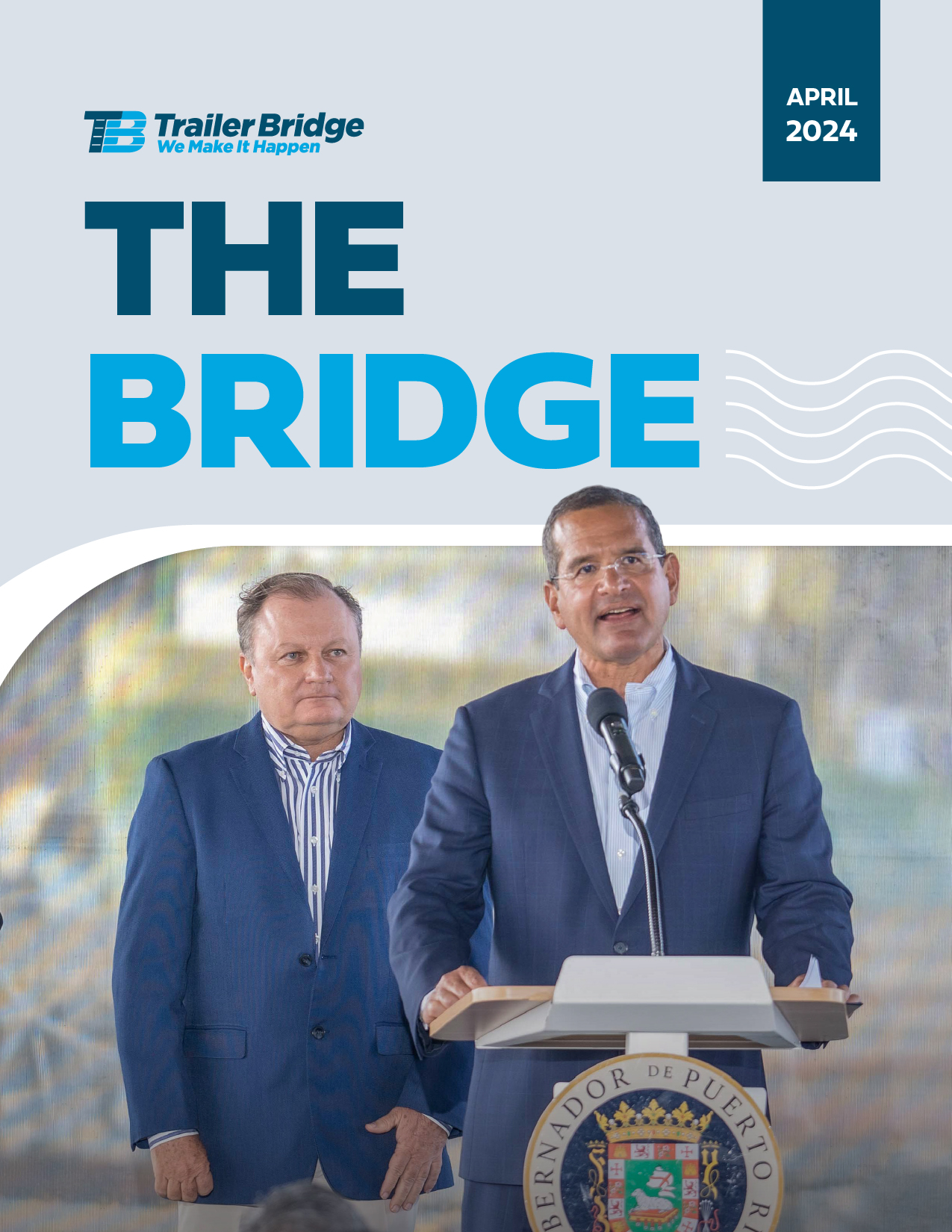
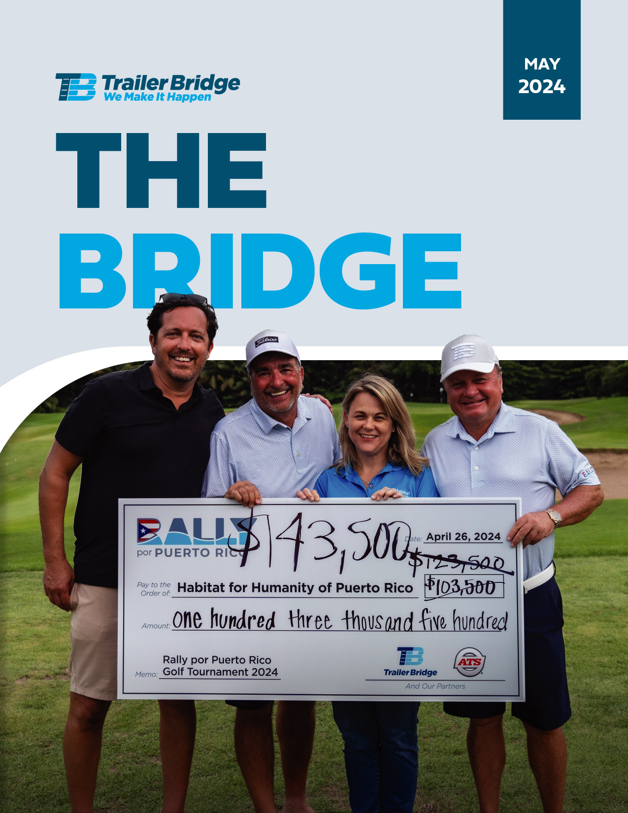
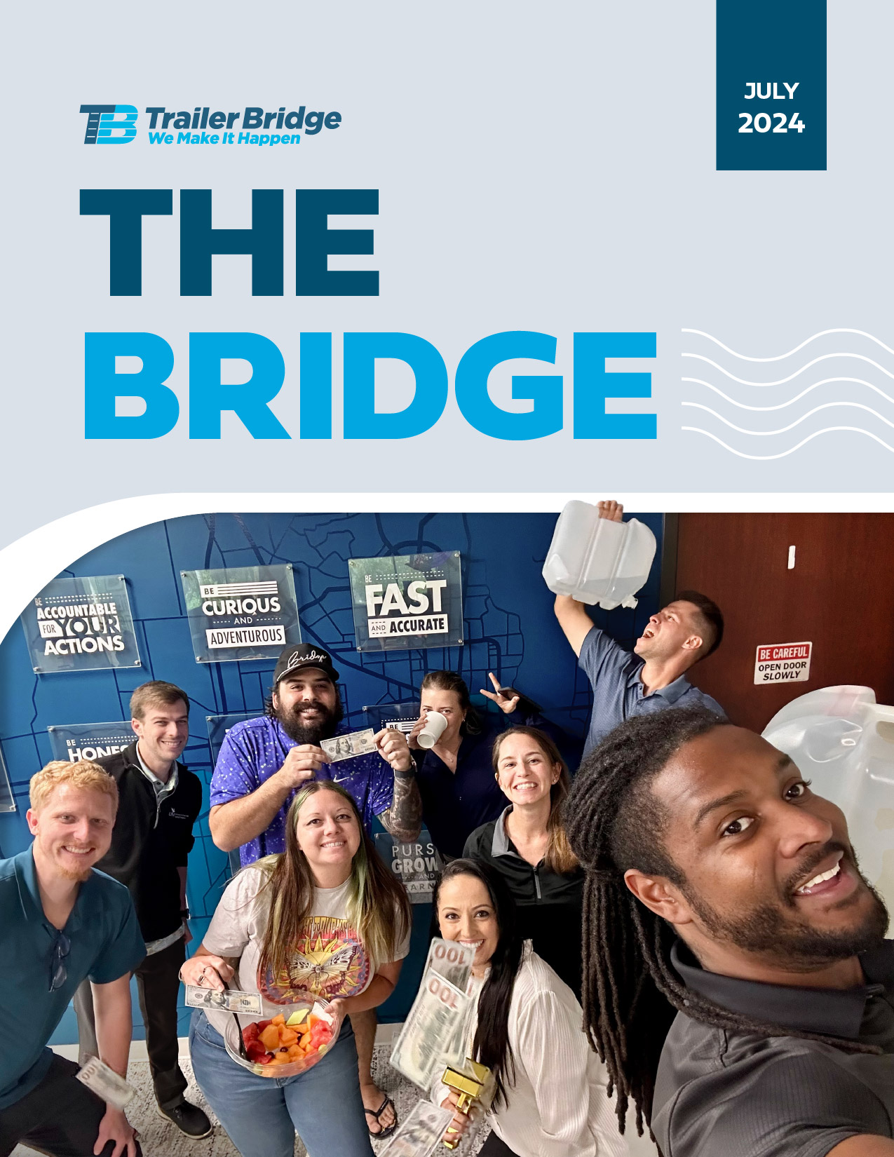
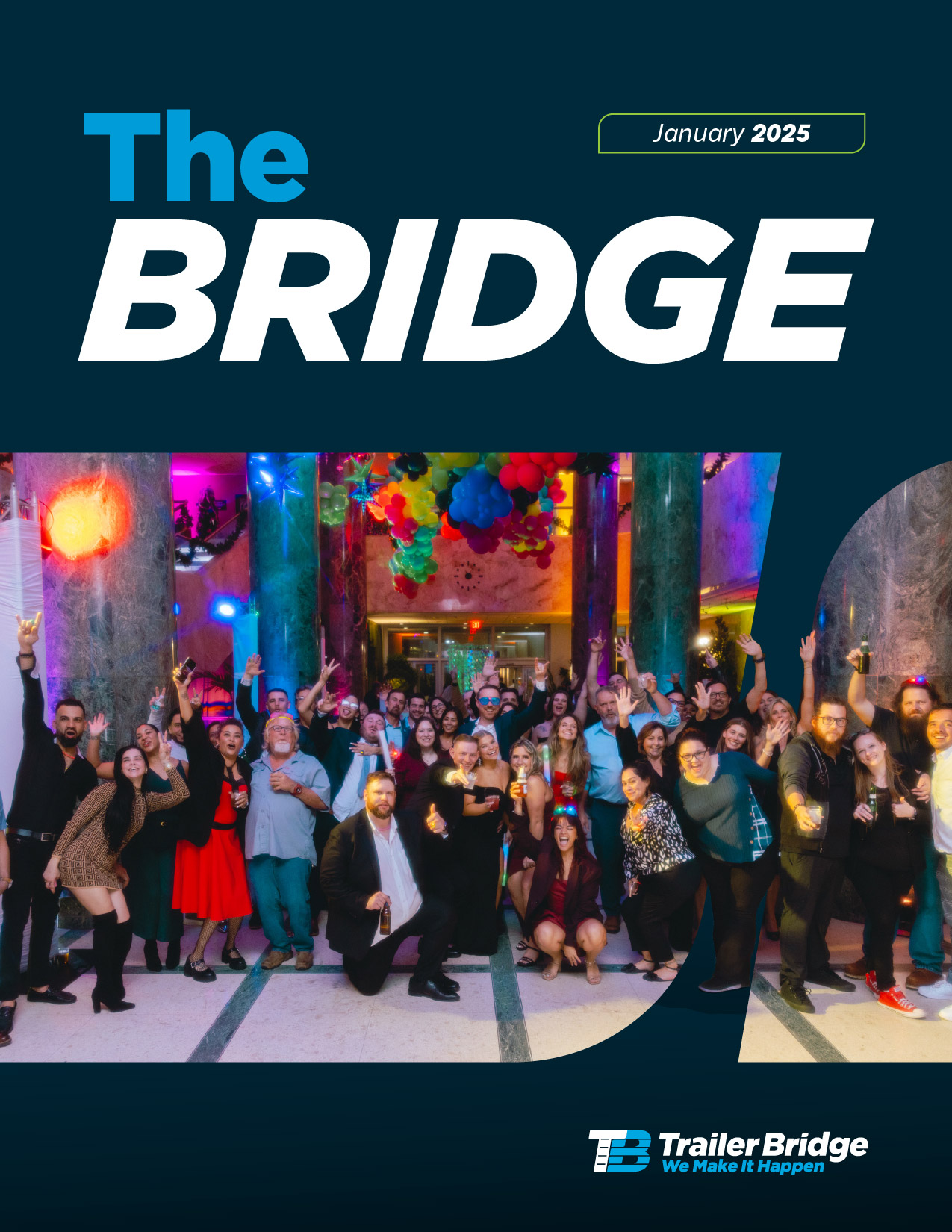
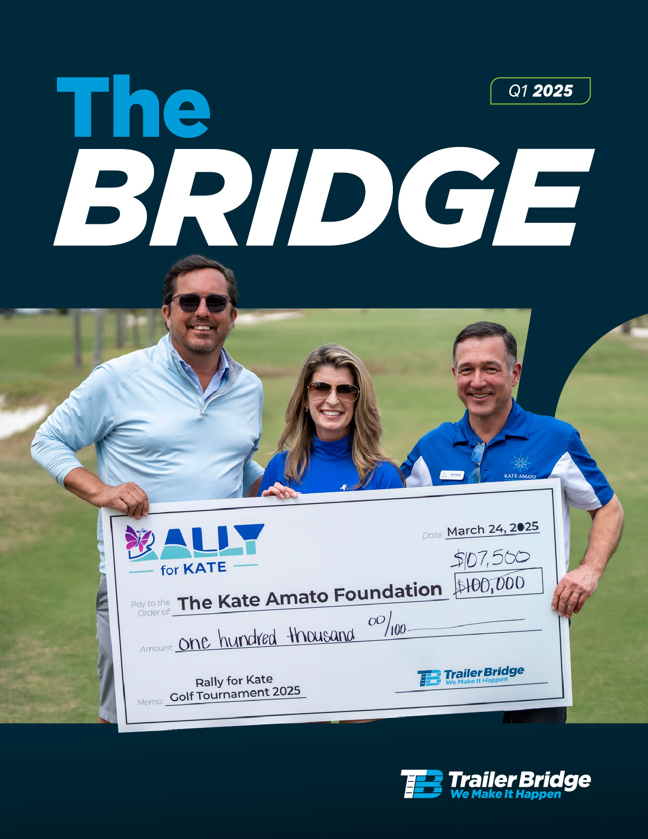
INTERNAL PUBLICATION
The Bridge Newsletter
The Bridge is an internal publication created to keep employees informed about company news, benefits, events, deadlines, and achievements. I led the redesign of its look and feel to increase employee engagement, introducing a more dynamic layout with asymmetrical compositions, overlapping elements, and bold visual cutouts—while preserving clarity and readability.
The refreshed design not only heightened employee interest in the publication but also strengthened overall communication between the company and its employees.
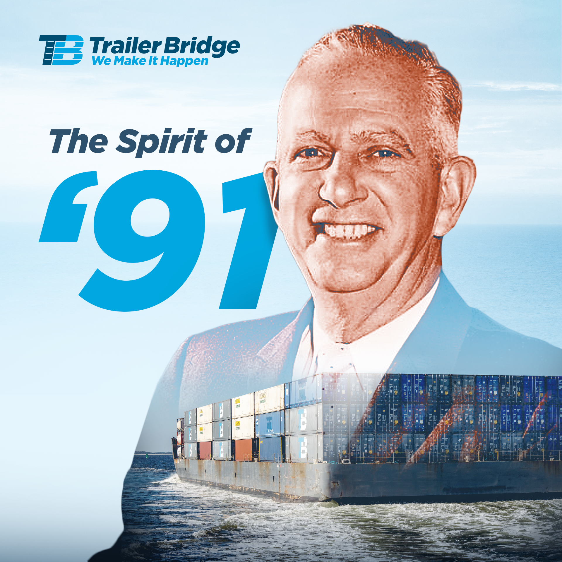
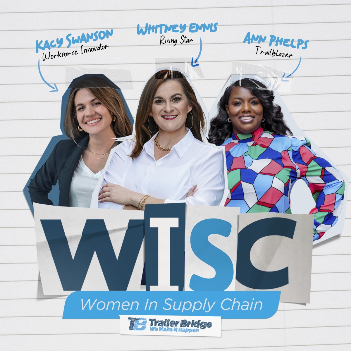
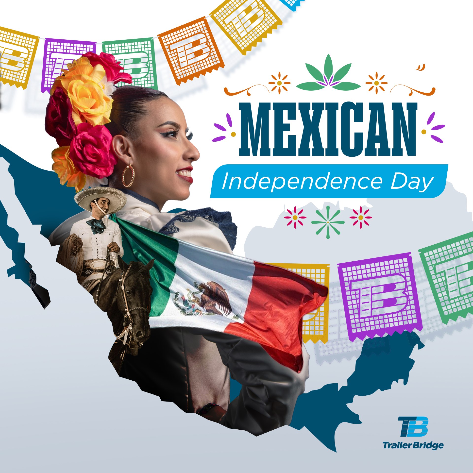
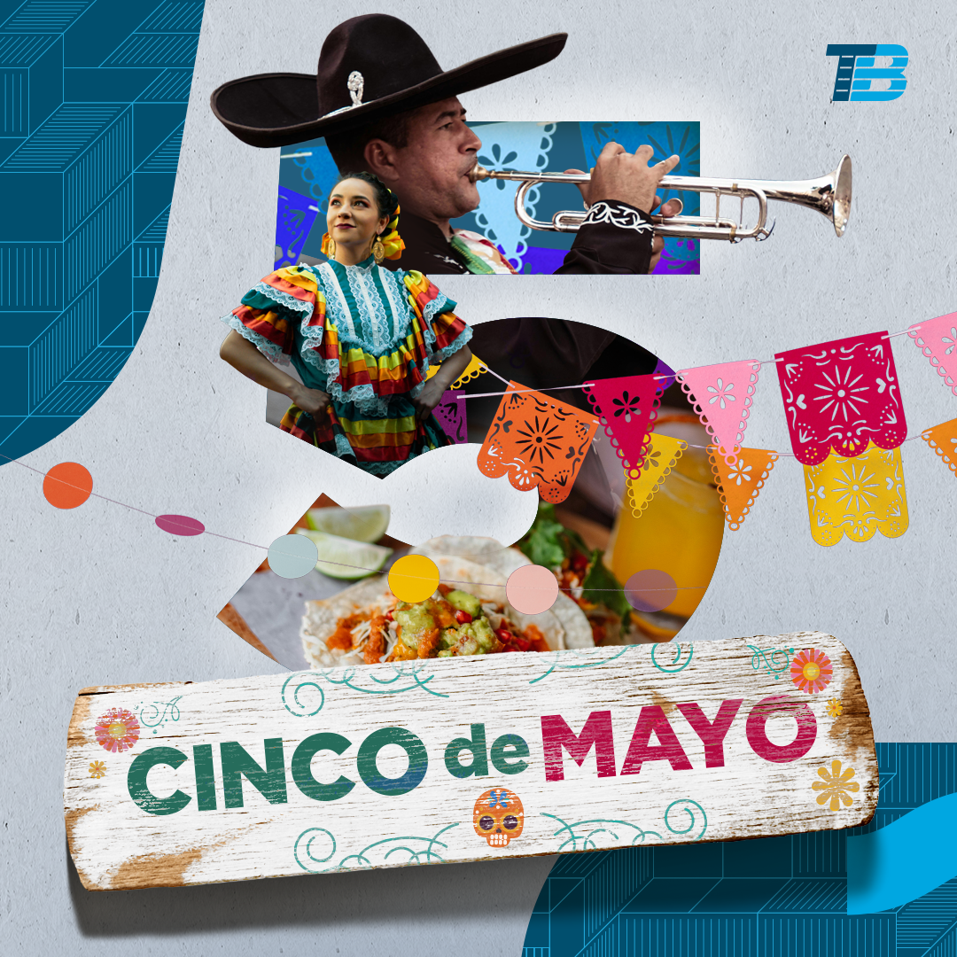
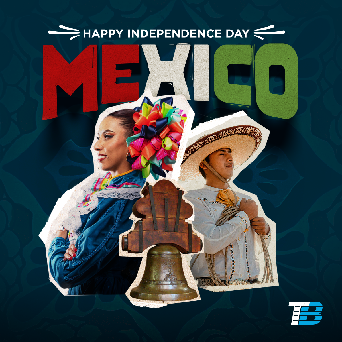
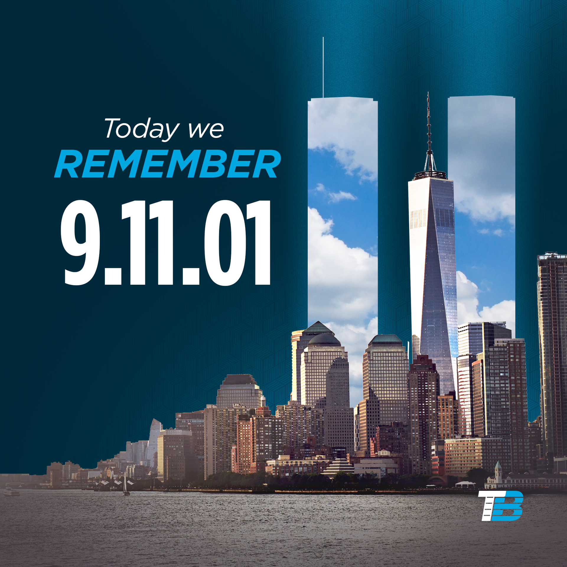
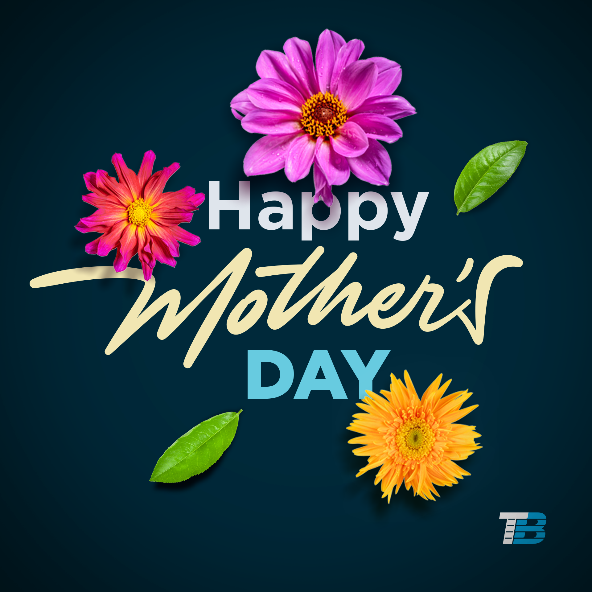
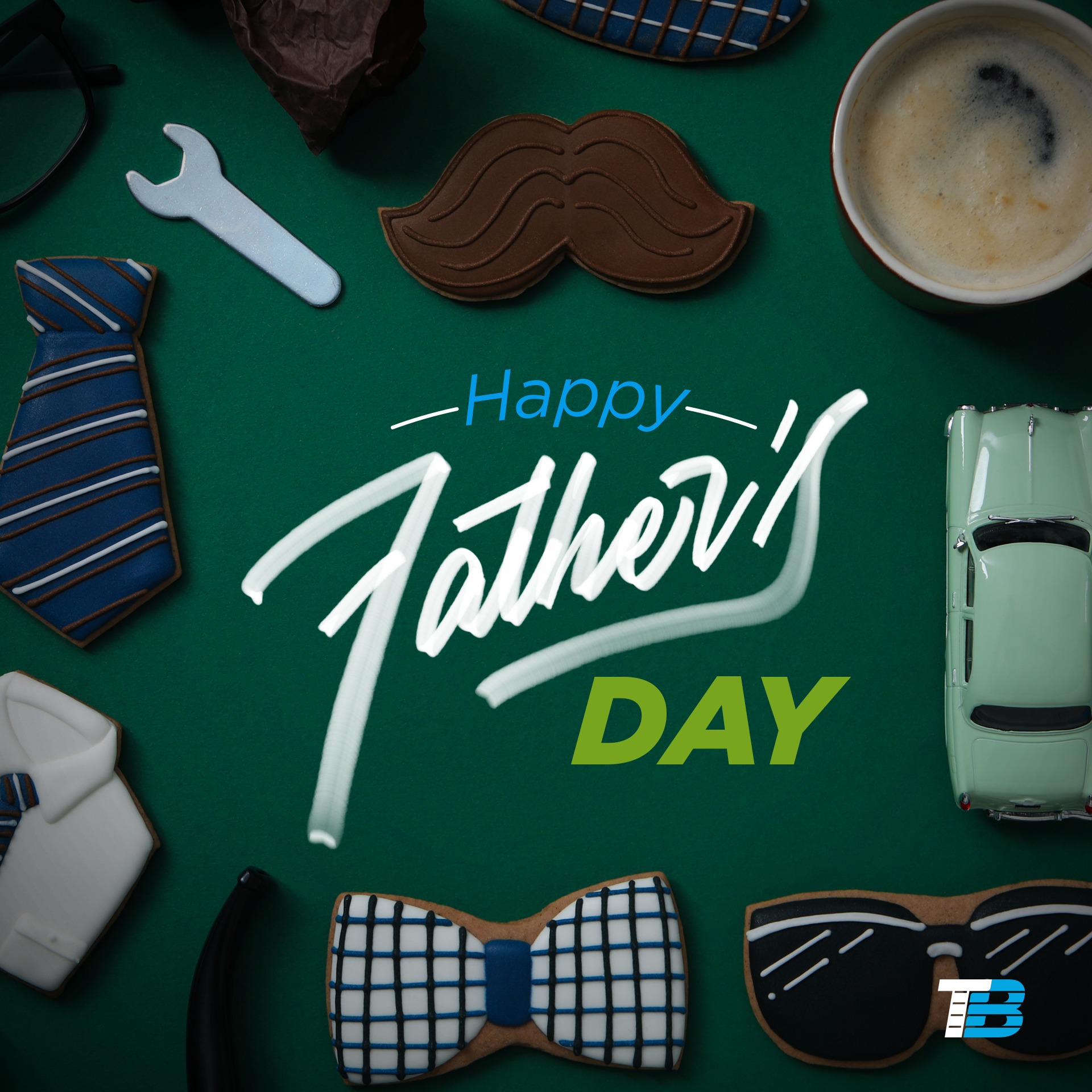
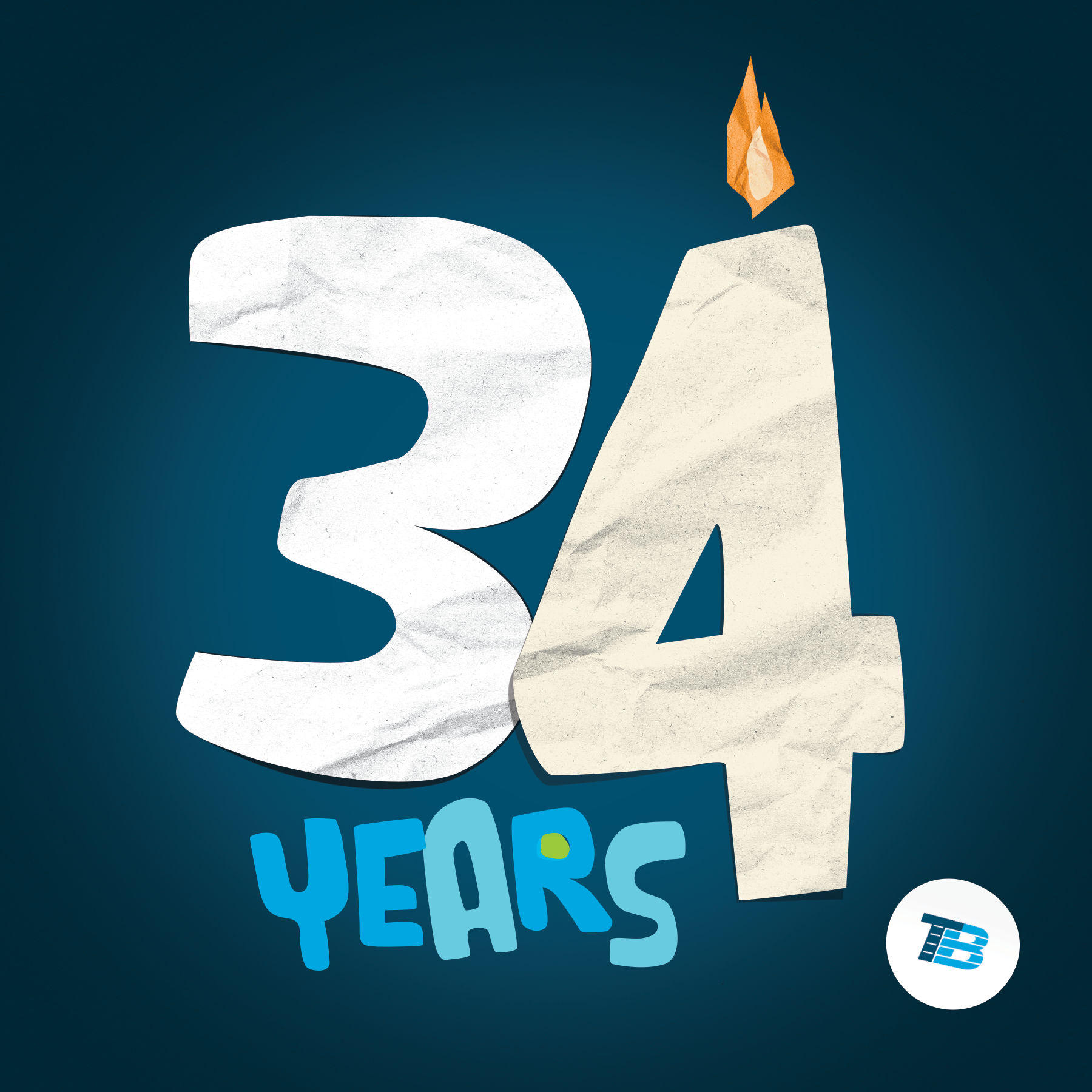
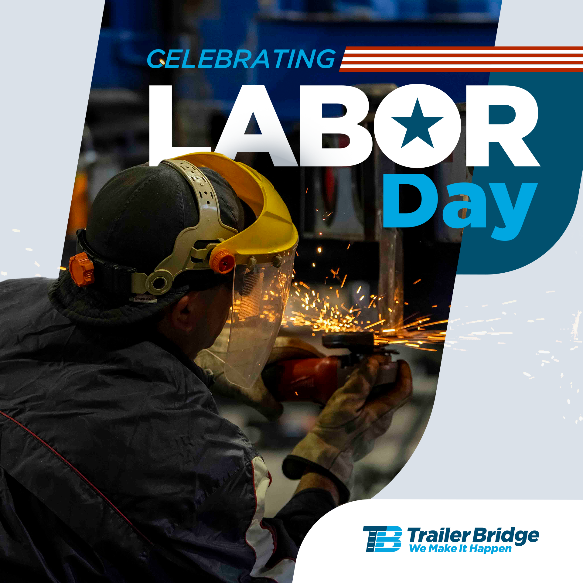
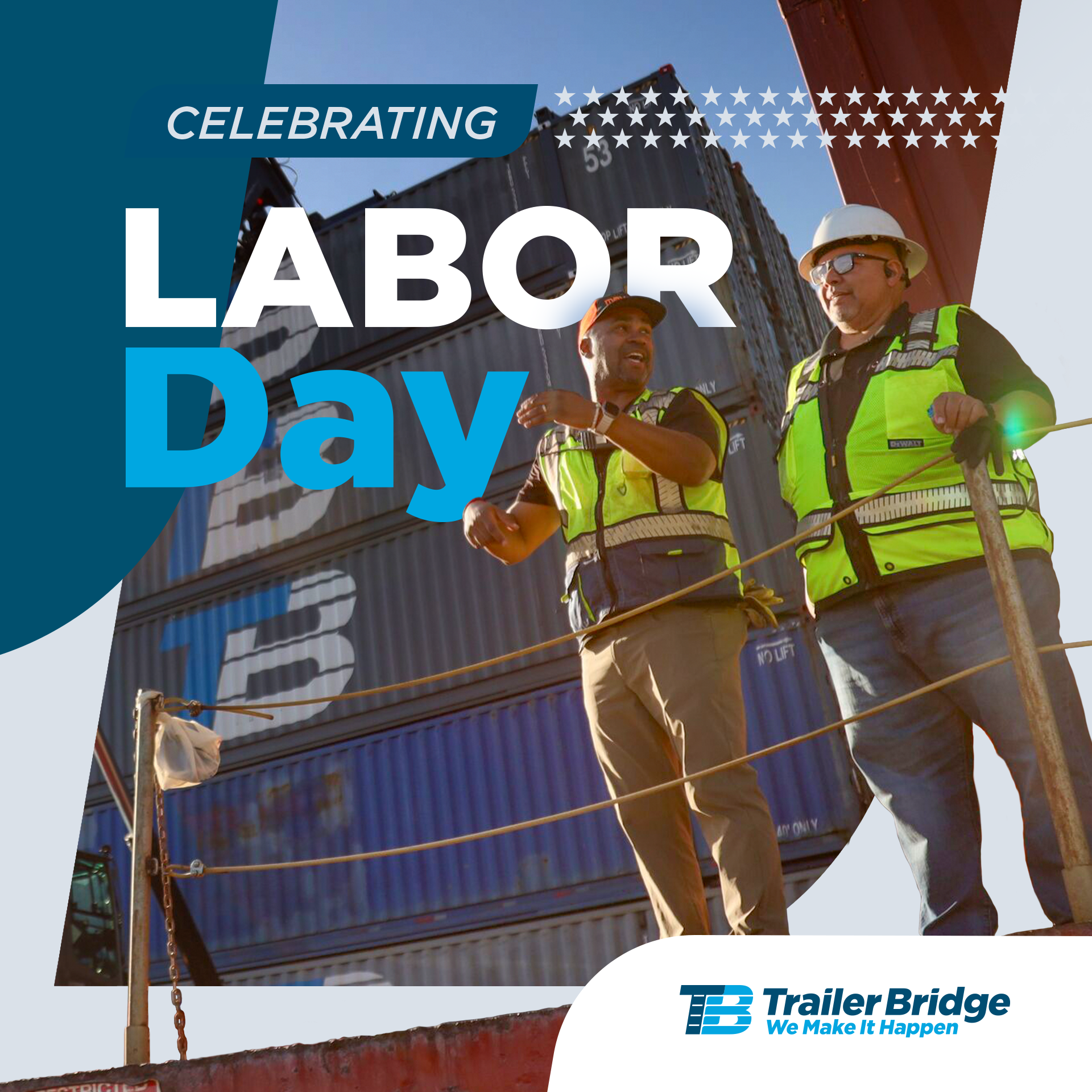
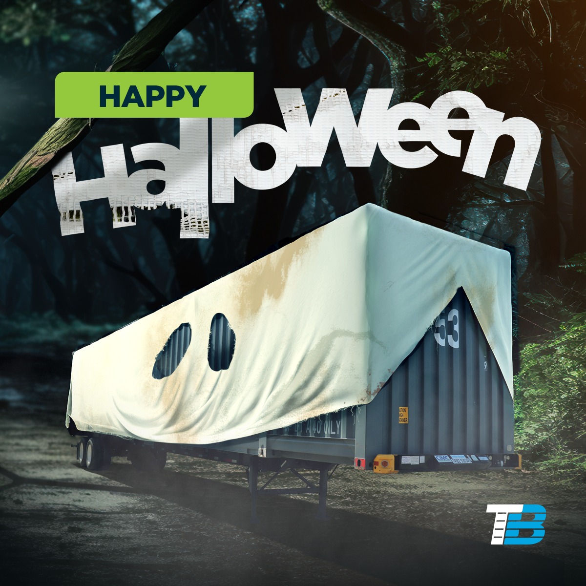
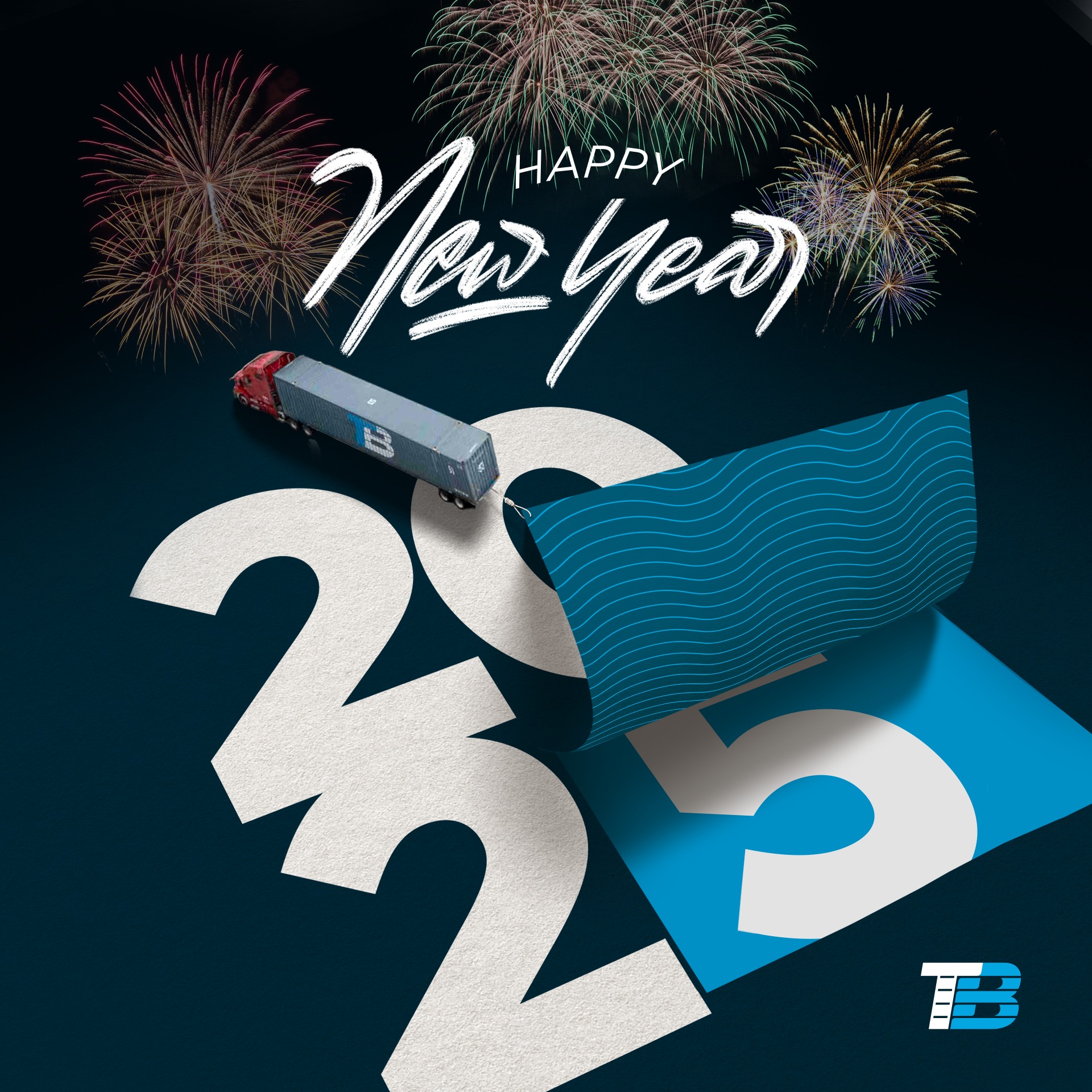
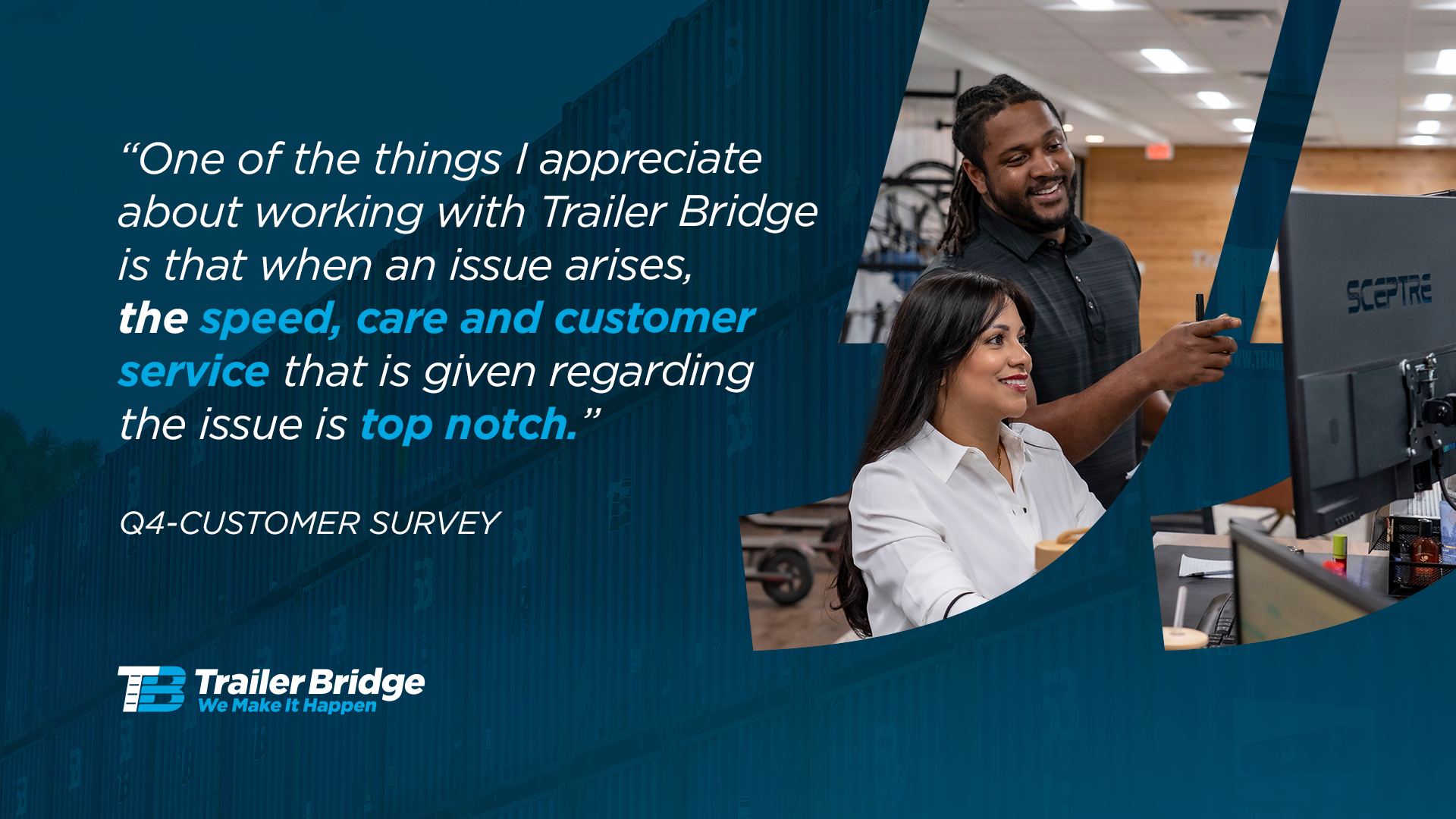
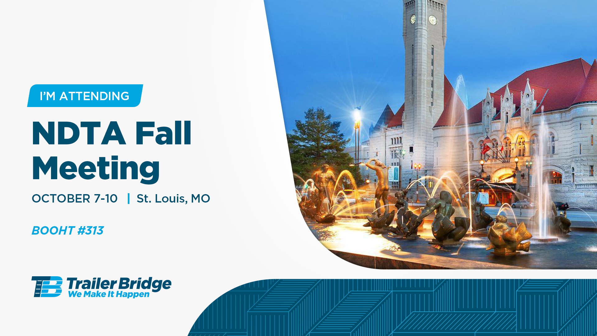
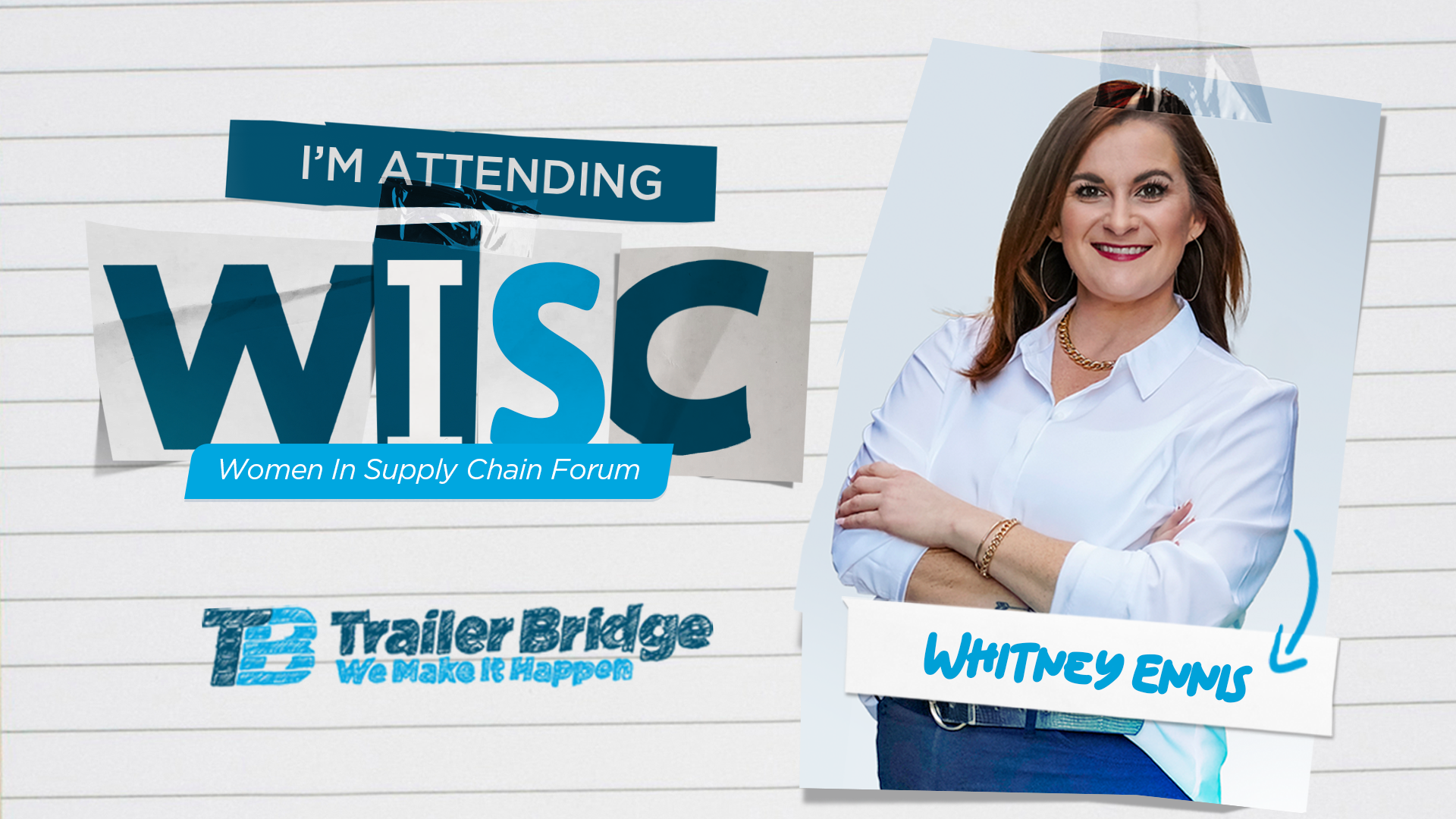
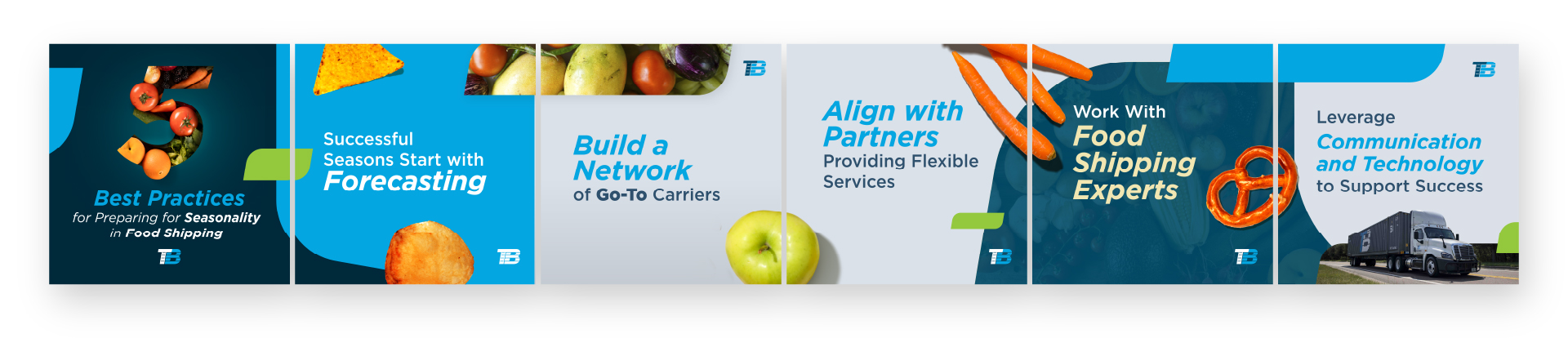
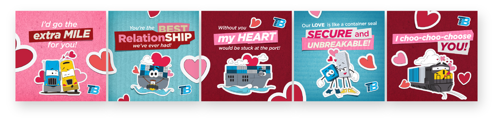
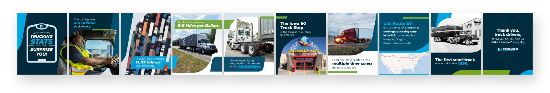
MARKETING
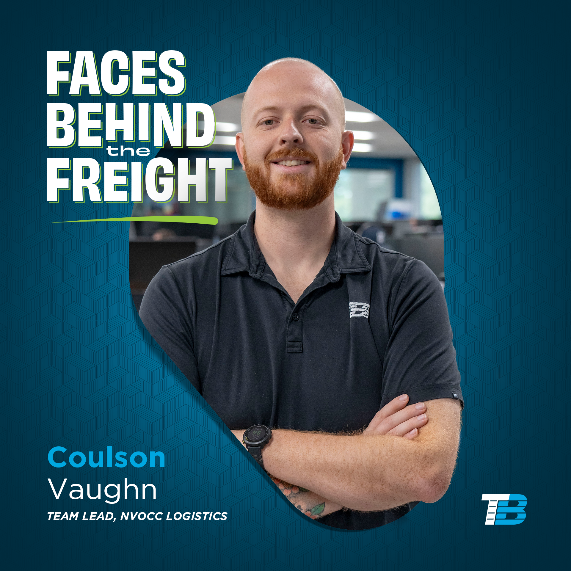
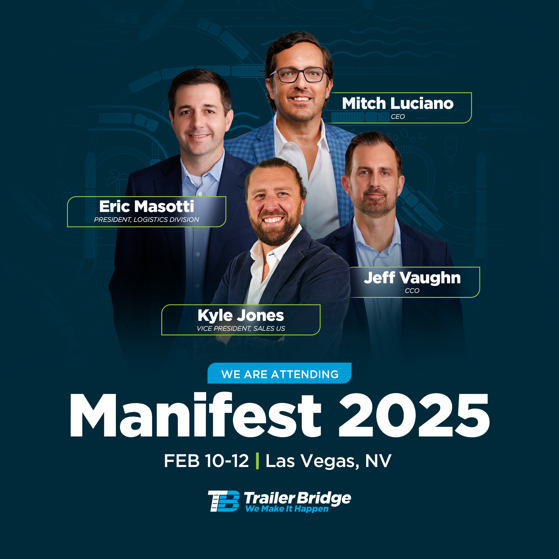
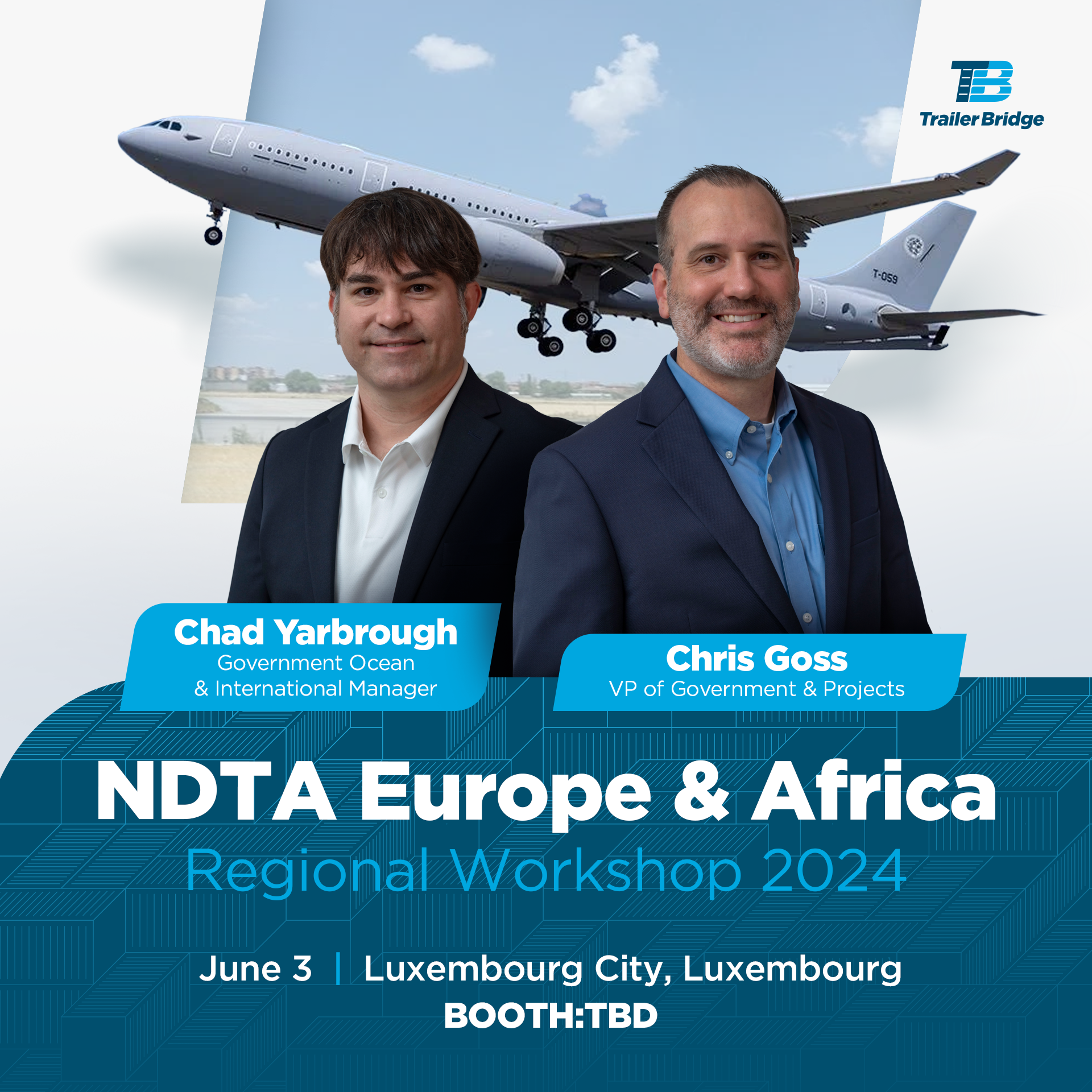
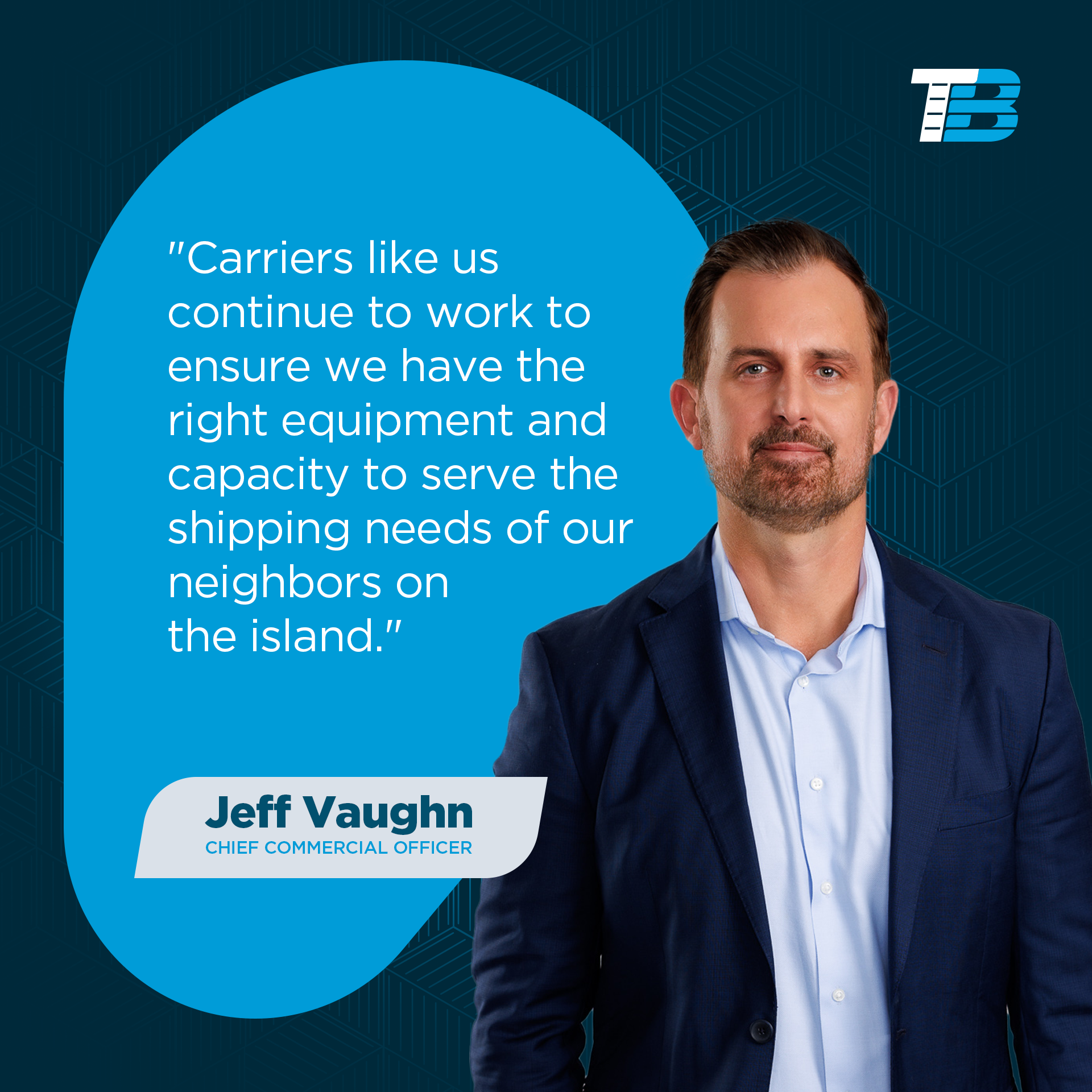
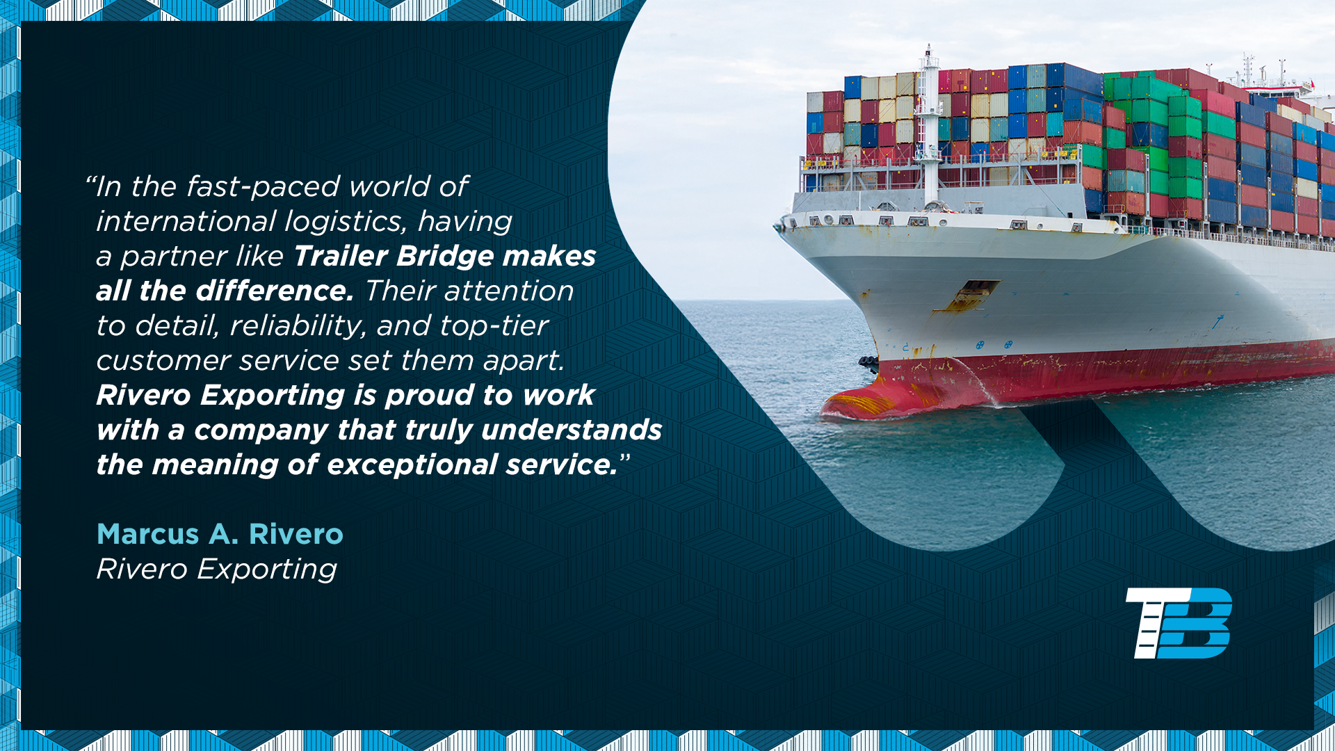
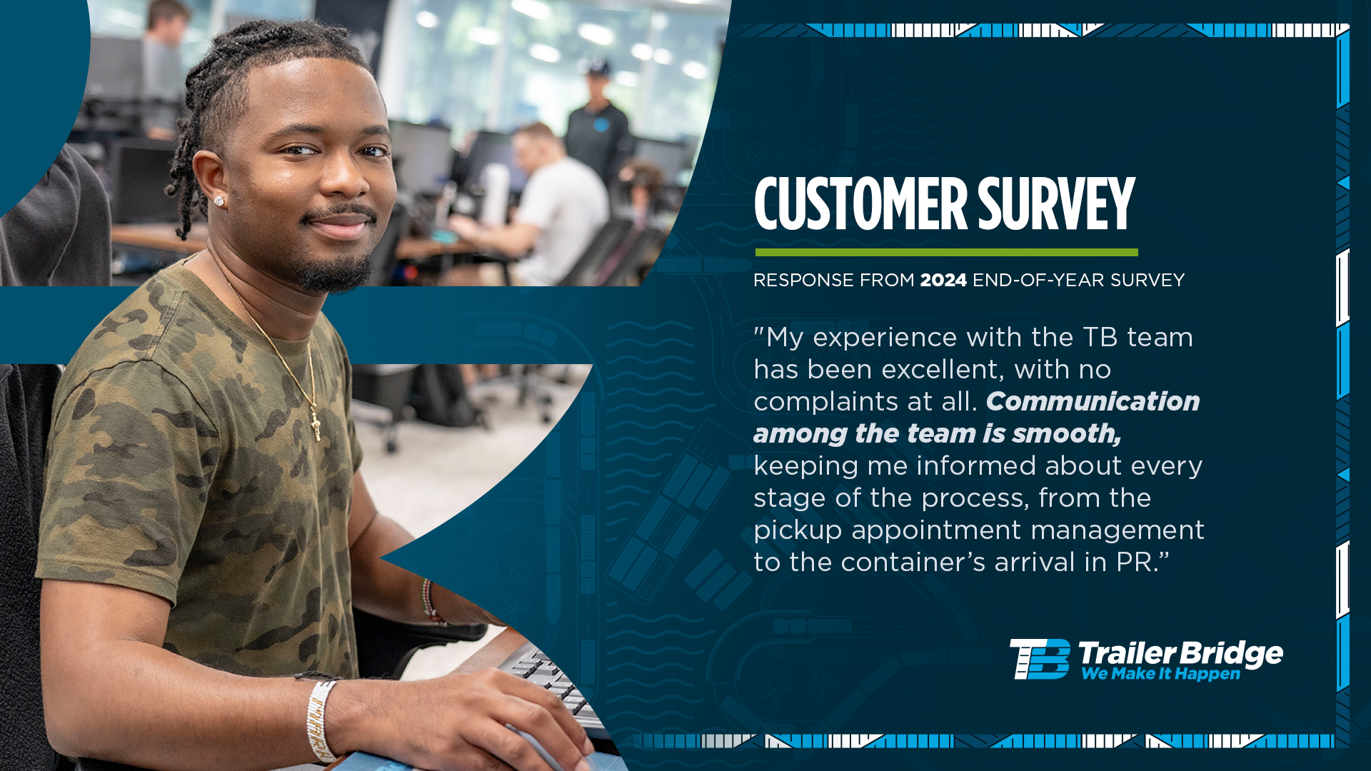
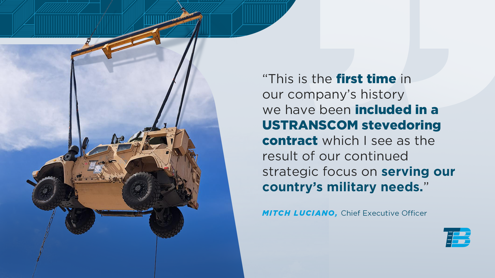
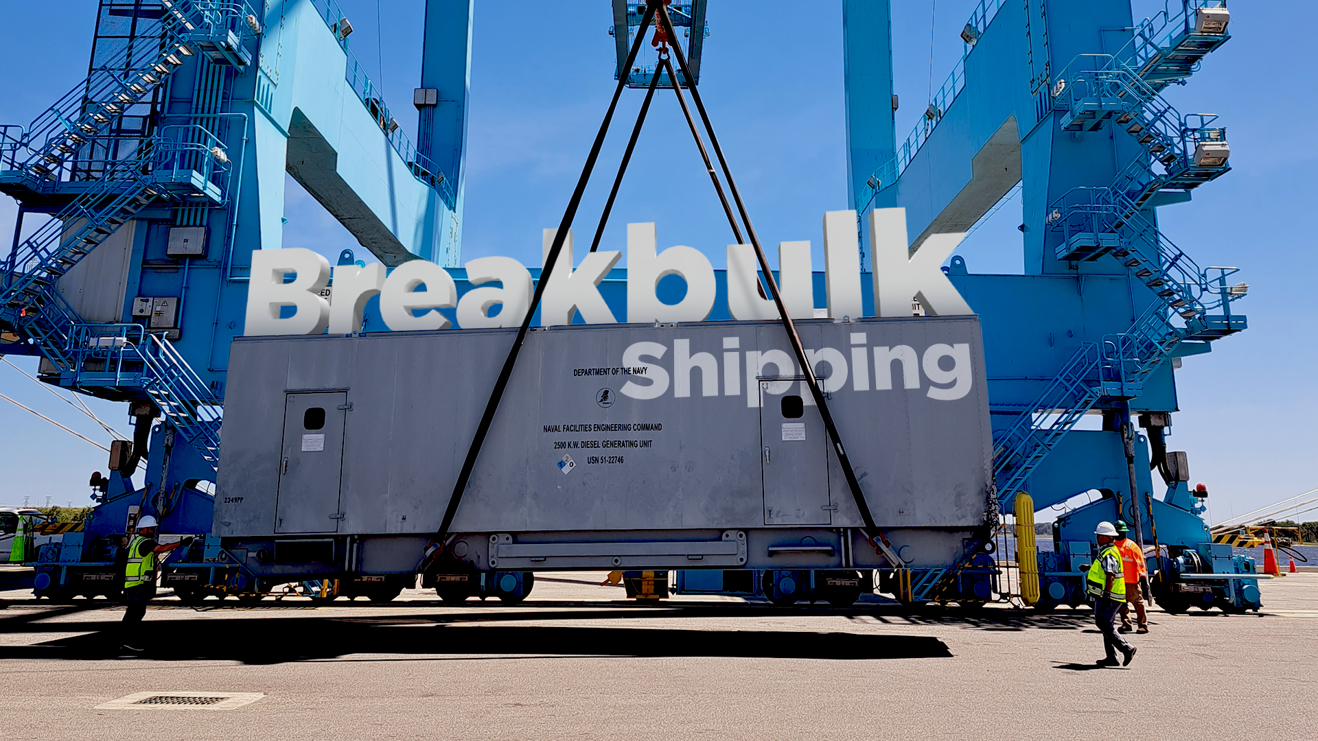
Social Media
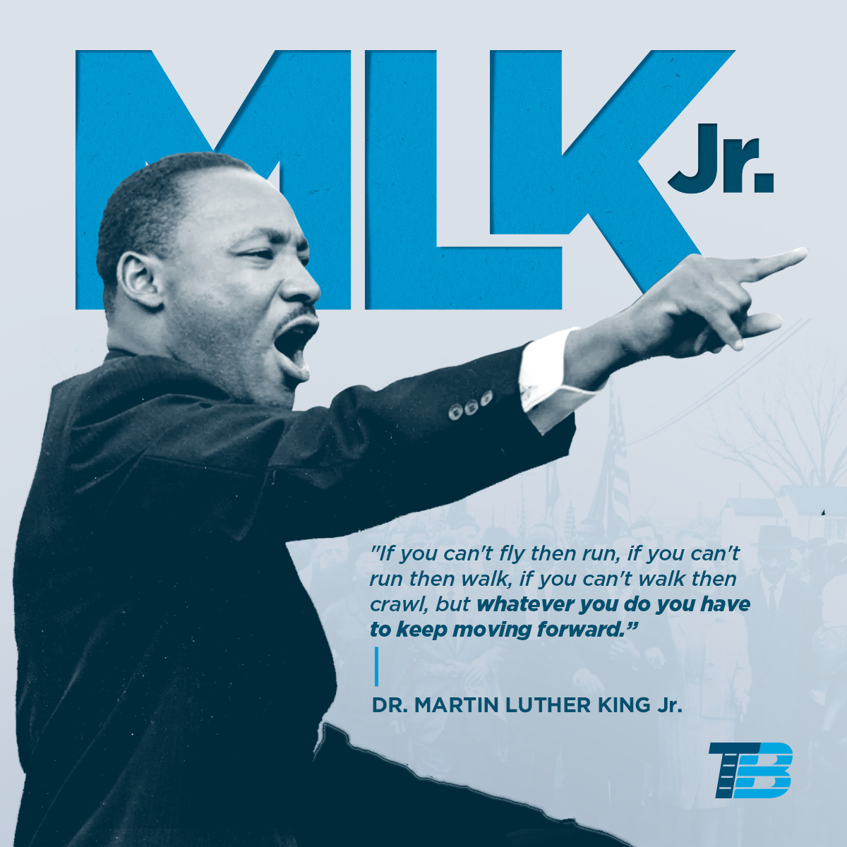
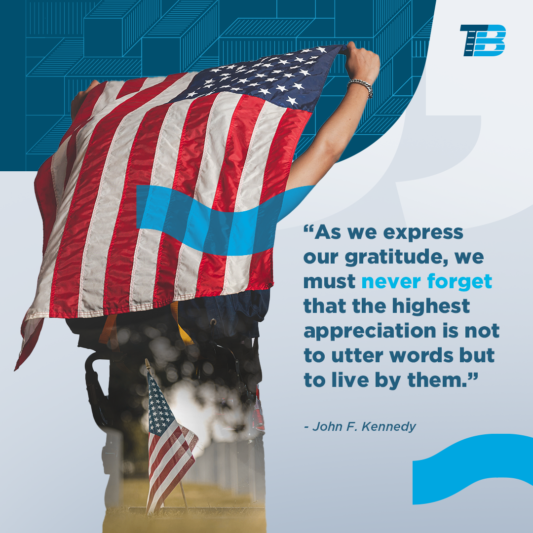
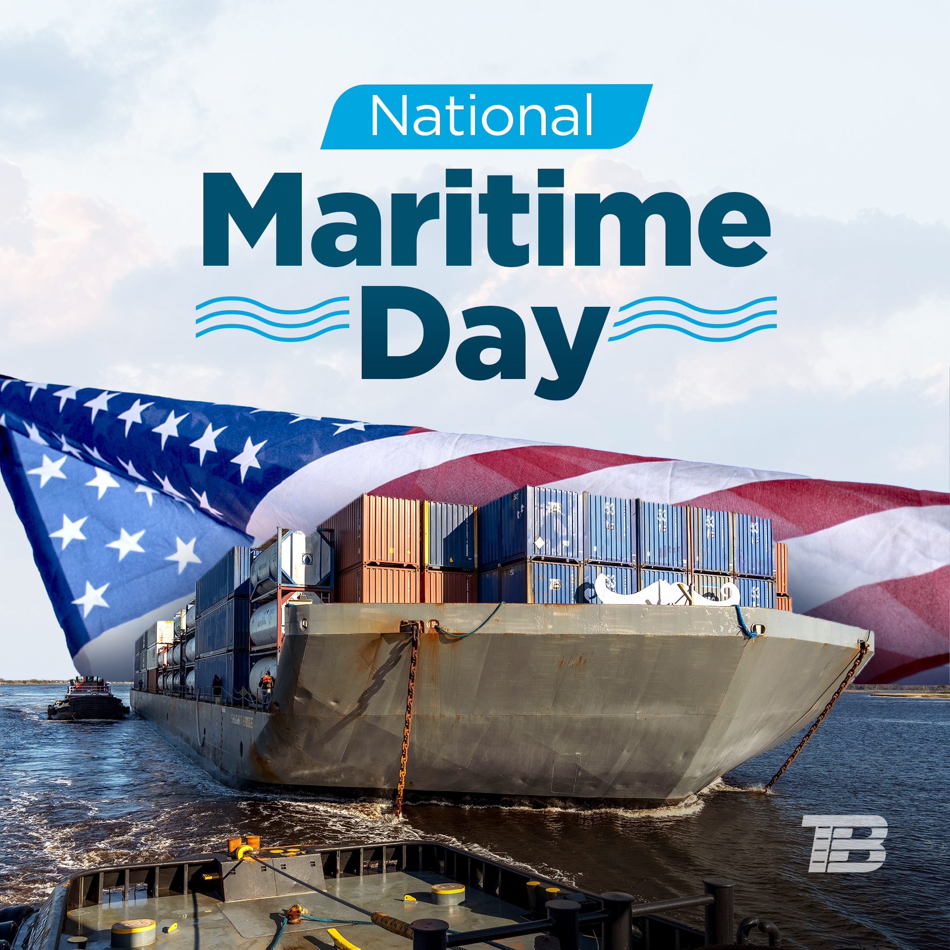
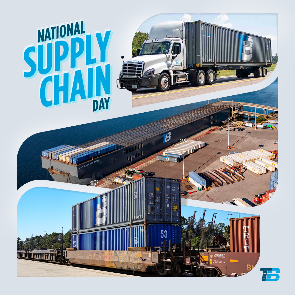
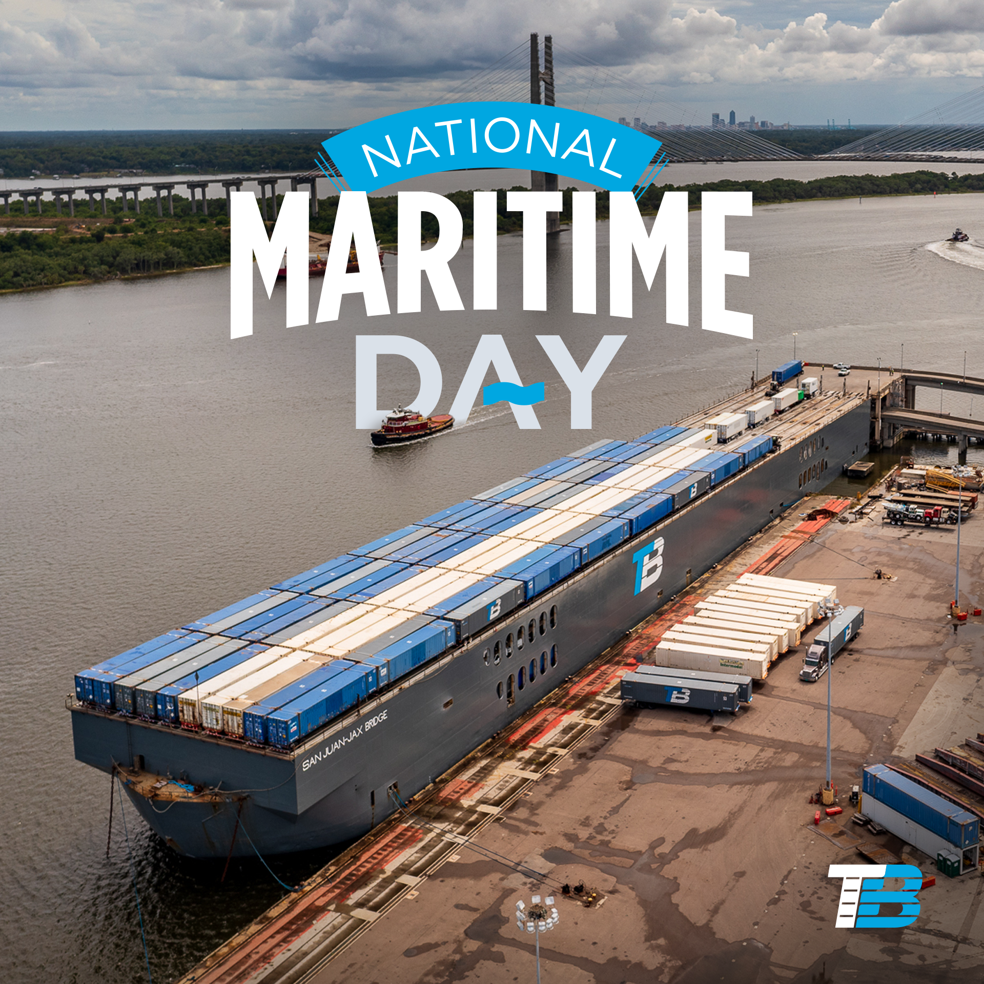
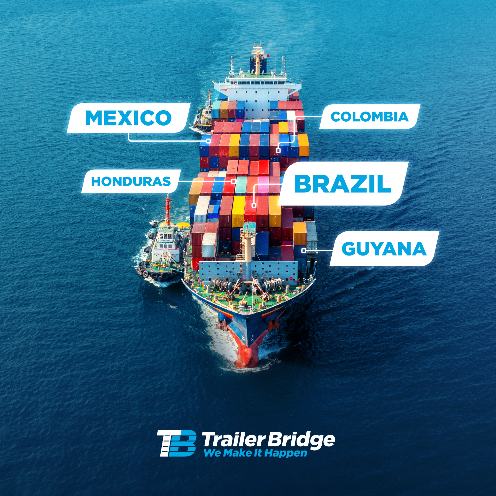
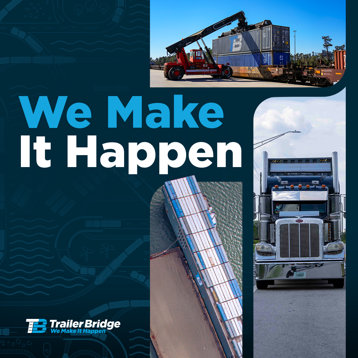
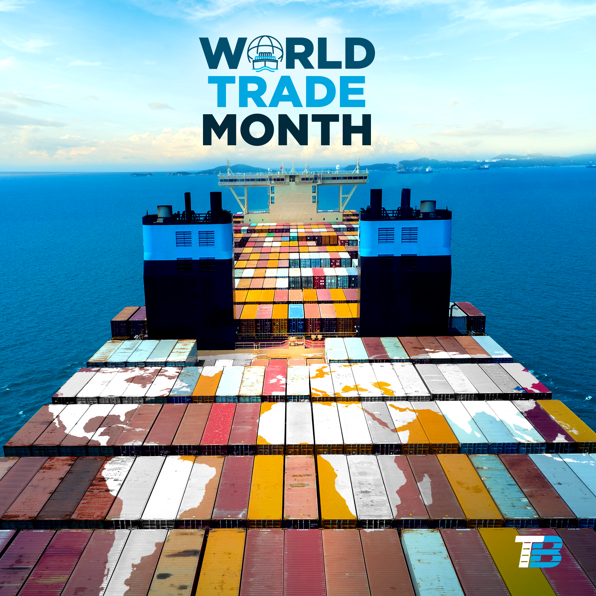
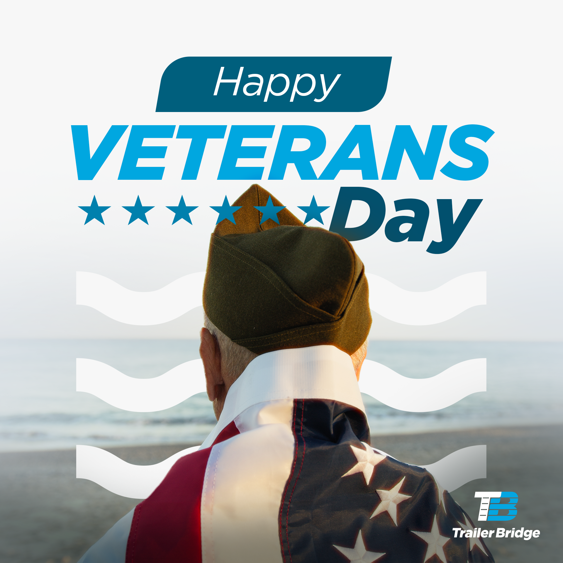
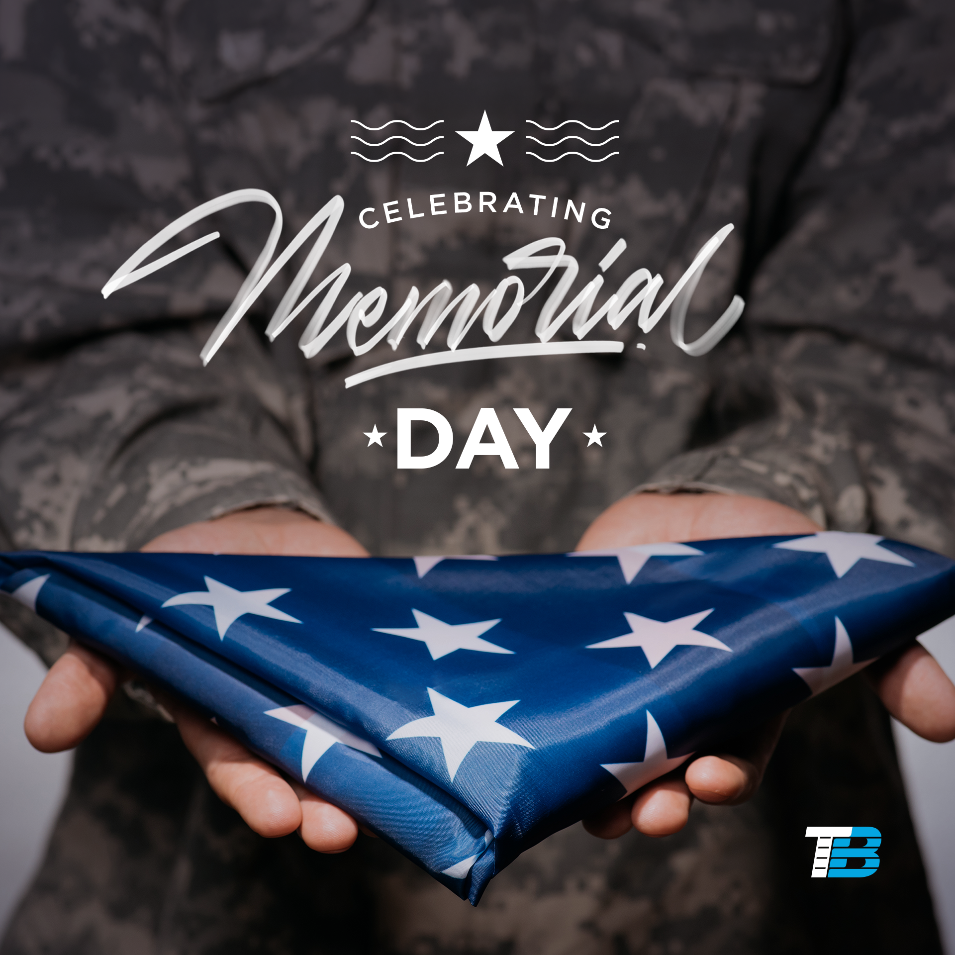
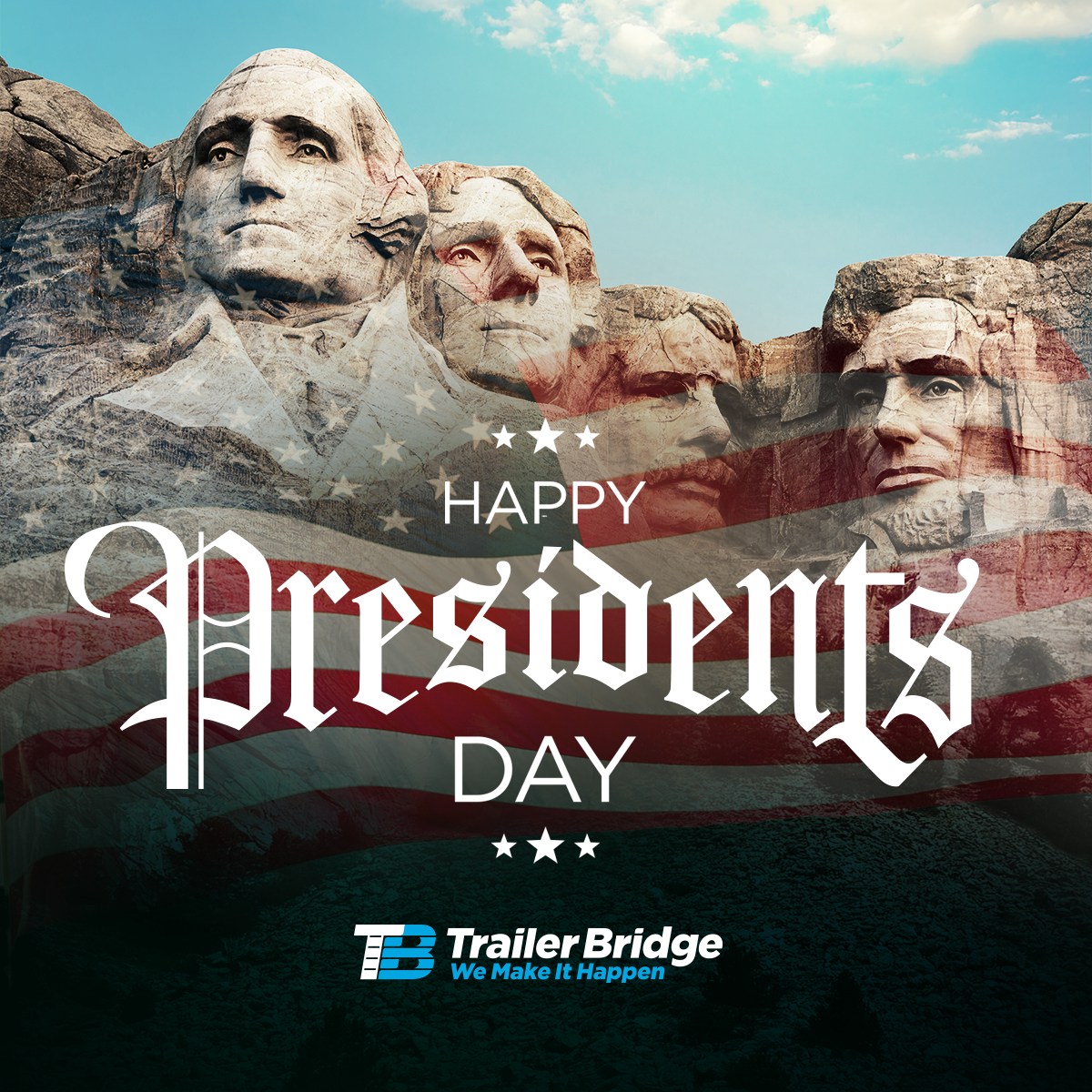
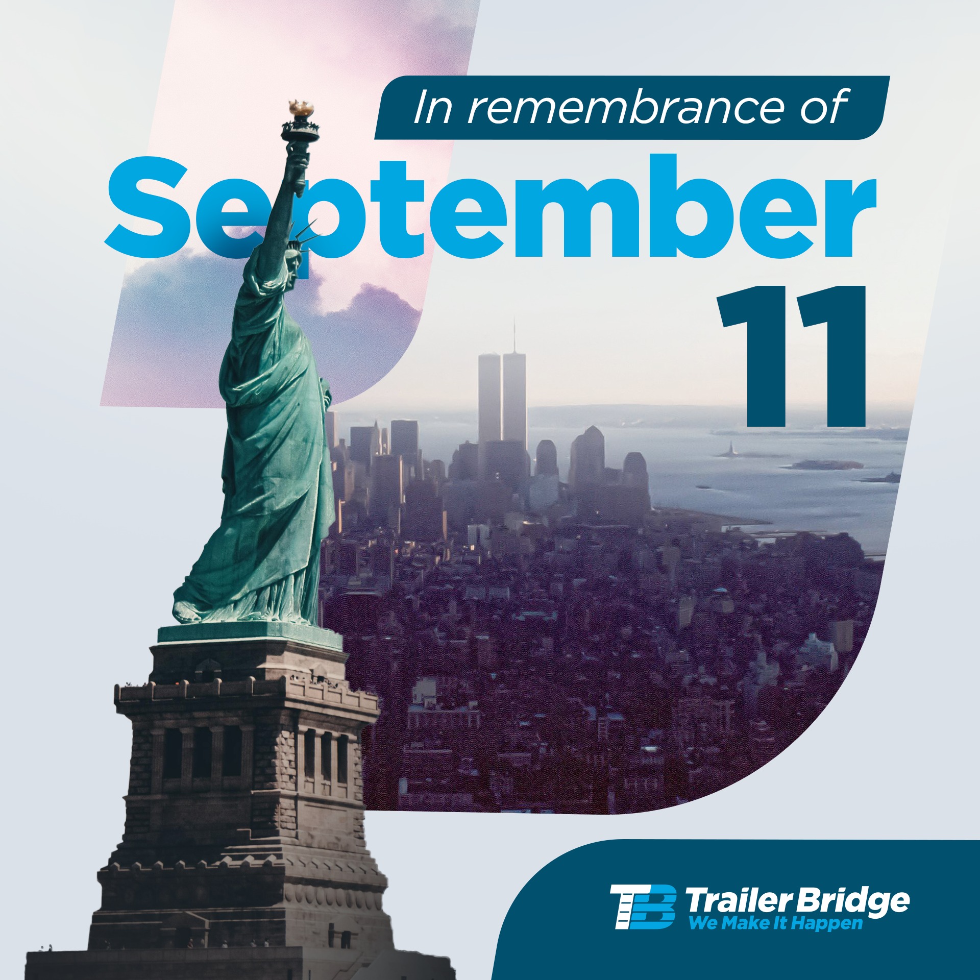
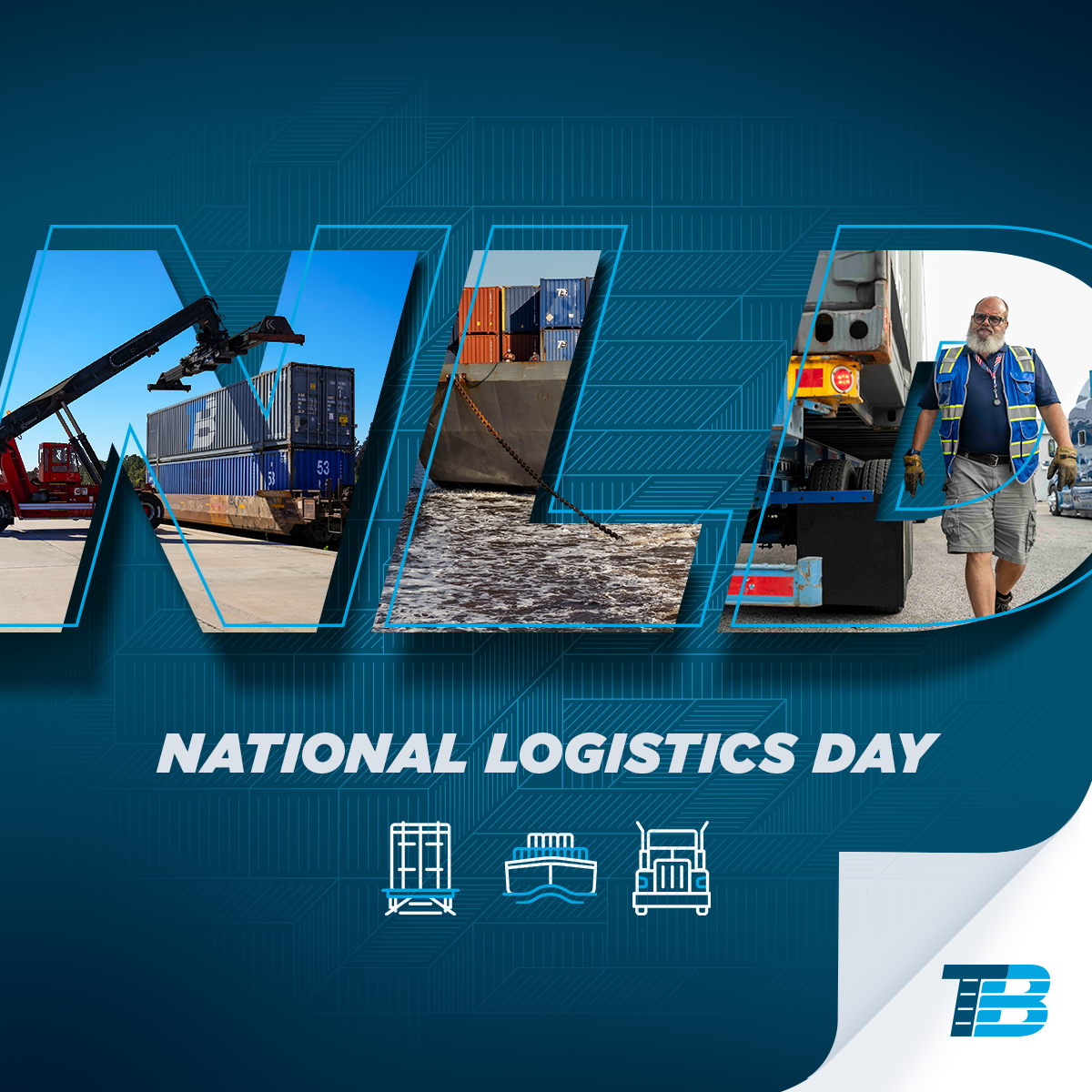
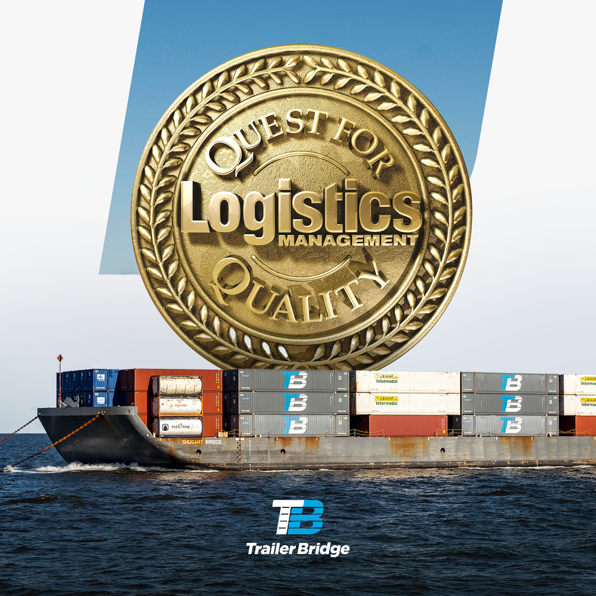
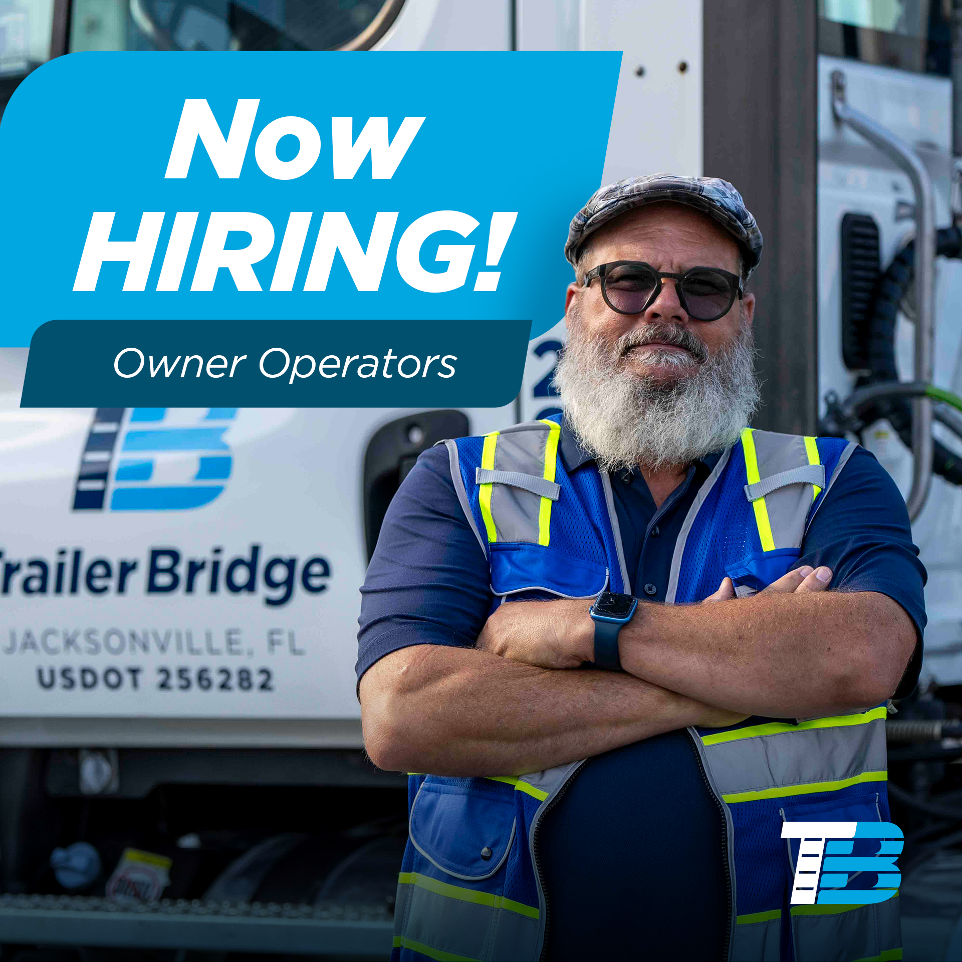
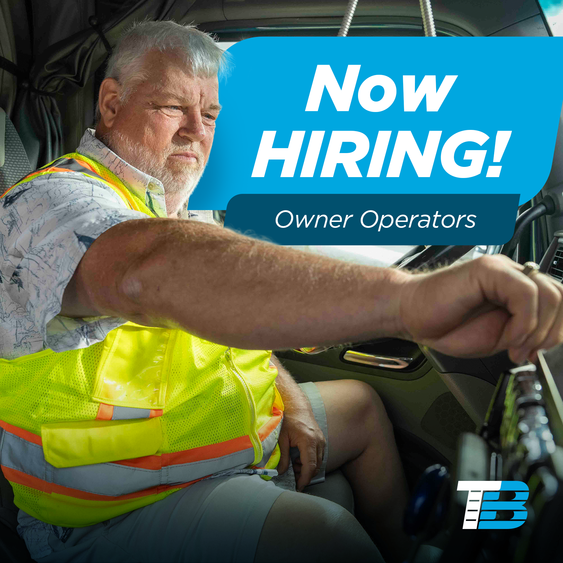
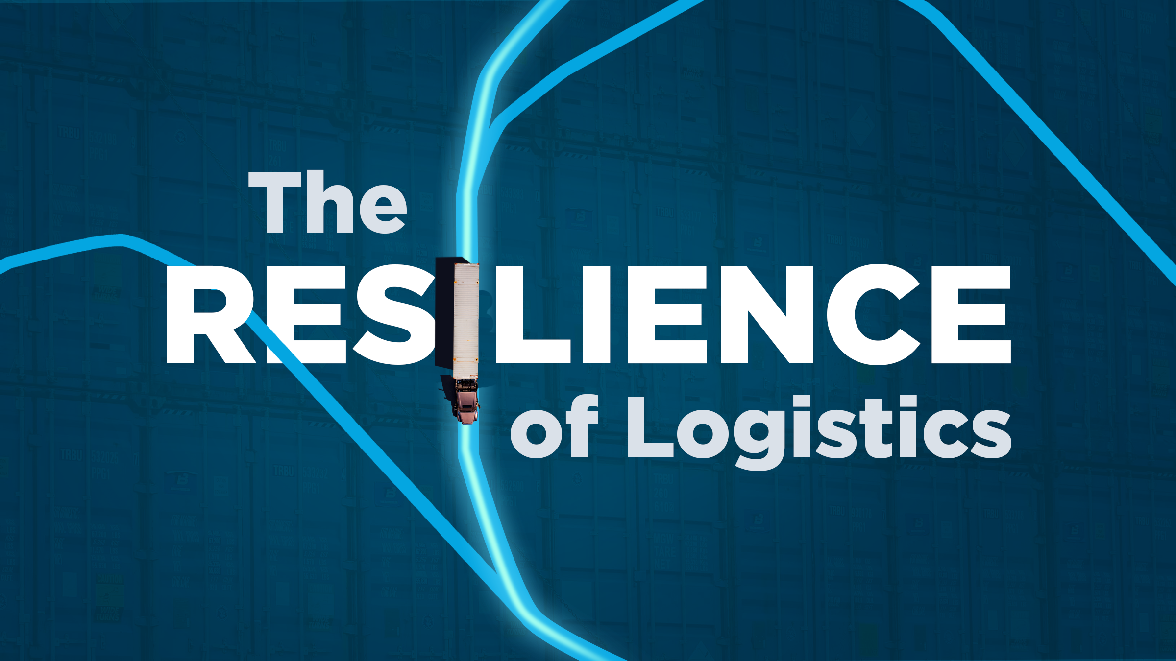
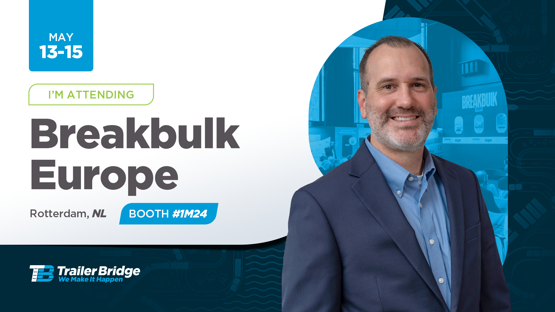
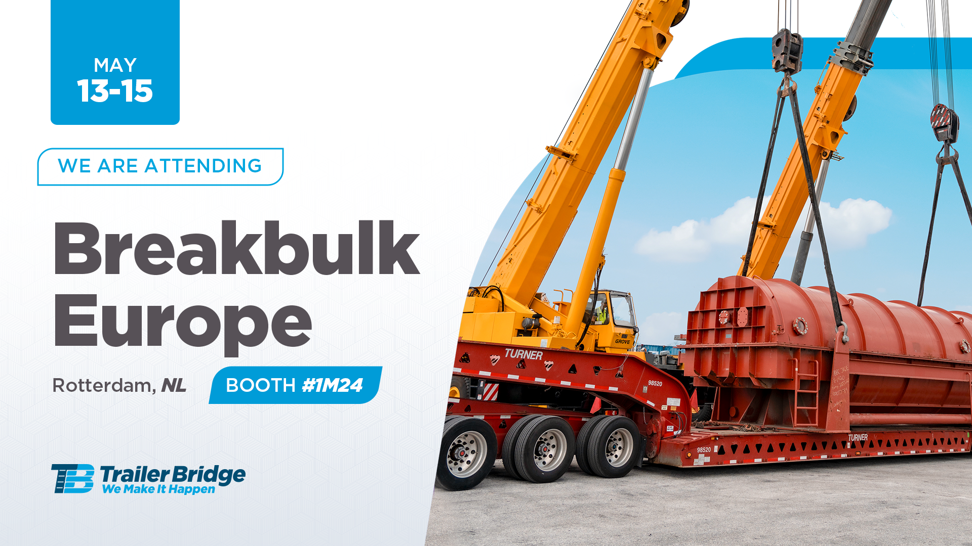
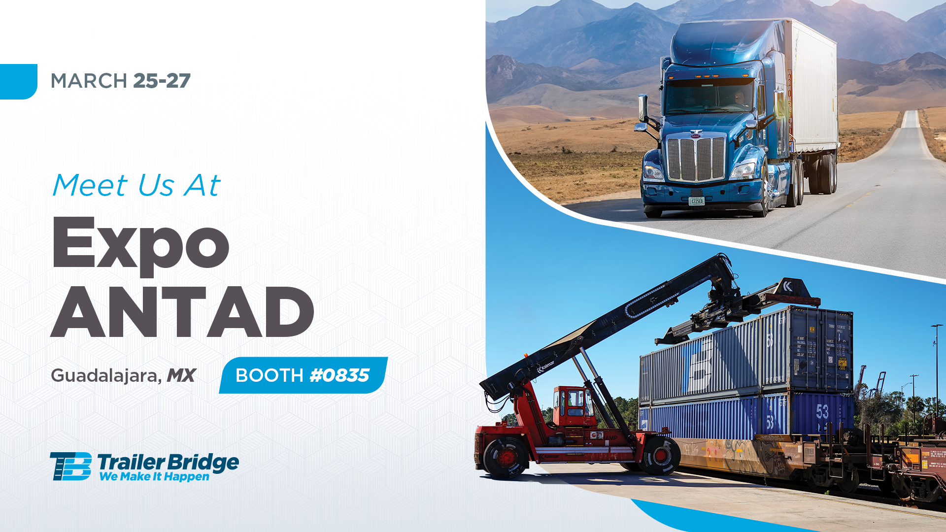
Trailer Bridge has consistently differentiated itself by challenging industry norms, and this philosophy guided the brand’s social media visual direction. Within the logistics industry, competitors tend to rely on repetitive visual conventions—stock photography, predictable imagery (trucks, ships, containers), and rigid, formulaic layouts—resulting in content that blends together.
To break away from this pattern, I developed a more energetic and ownable visual system. The approach introduced custom shapes and textures derived from the company’s core services and assets, dynamic cutouts that enhanced interaction between elements, and custom illustrations that highlighted the human touch central to Trailer Bridge’s culture.
Strategically, this new visual language helped the brand stand out in crowded social feeds, increased visual recognition, and reinforced Trailer Bridge’s positioning as a modern, people-centered company—strengthening engagement and overall brand perception.

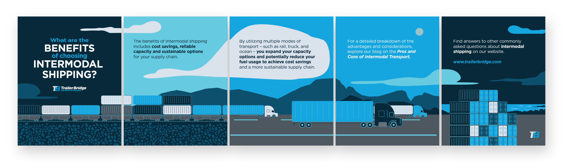
SOCIAL MEDIA
Videos & Motion Graphics
As part of the company’s initiative to increase brand engagement, we introduced motion graphics and video content across social media. I developed all illustrations from initial sketches through final execution, allowing me to fully apply my illustrative skills and creative vision. This approach helped differentiate the brand and stand out from competitors in a highly saturated industry.